Intro to AoG - I - Fundamentals
Welcome to AlgebraOfGraphics!
This intro tutorial series will guide you as you take your first steps, going from simple scatter plots all the way up to complex compositions of multilayered facet plots. Along the way, you will learn about the philosophy behind AlgebraOfGraphics's approach to data visualization and how all its pieces fit together to form one coherent toolbox.
To follow along, you only need a computer with Julia installed, an internet connection to download packages and example data, and ideally an environment such as VSCode, Pluto or Jupyter Notebooks which can display plots alongside the code. No familiarity with plotting or data analysis in Julia is required but basic familiarity with the Julia language is expected such that you can read and understand the code.
If you encounter typos, confusing explanations or want to suggest other improvements, you're welcome to open an issue on GitHub. With that, let's get into it, starting with a little bit of background!
What is AlgebraOfGraphics?
AlgebraOfGraphics, or AoG for short, is a package for data visualization. There are many different approaches to visualizing data but AlgebraOfGraphics follows in the tradition of ggplot2, which popularized the concept of a "grammar of graphics". The idea was that visualizations should not be drawn imperatively by executing lots of low-level commands like "draw a line" or "draw a point" or "place some text", but instead by describing a higher-level "intent" how your tabular data should be transformed into a visual end result using a "grammar" or domain specific language.
In the Julia ecosystem, Makie.jl is one of the most-used data visualization libraries. While it is very flexible and gives users a lot of freedom, it follows the low-level imperative approach which leaves a lot of convenience on the table.
AlgebraOfGraphics was built on top of Makie to give users the ability to easily create their most commonly needed visualizations in a clear and descriptive way, while still retaining the ability to apply all of Makie's underlying feature set to make more unusual modifications which are hard to cover with a generic descriptive API. In contrast, ggplot2 turns plot specifications into relatively obscure data structures that are not necessarily easy to change later. Therefore, users have to rely much more on the availability of packages (of which there are admittedly many in the ggplot2 ecosystem) that solve specific visualization problems for them instead of being able to drop down to lower-level methods.
Here's a short overview of similarities and differences between ggplot2 and AlgebraOfGraphics:
| ggplot2 | AlgebraOfGraphics |
|---|---|
| Uses "tidy" (long format) tables as input. | "Tidy" tables are the most common input type, but wide data, pregrouped arrays, and other input types are also supported. |
Adds layers, attributes and scales to one big specification object using the + operator | Layers are built using the + ("stack on top") and * ("merge together") operators, forming an algebra which can remove code shared between layers. Scales and other global attributes are specified separately. |
| Defines all of the visual infrastructure itself, outputs low level graphics objects that are hard to modify directly. | Creates high-level Makie building blocks like Figure, Axis or Legend as well as plot objects like Lines or Scatter which can be modified more easily. |
geoms specify visual components and stats statistical transformations, but some geoms have default stats and vice versa | Layers with the visual transformation feed their associated data directly to Makie plotting functions. Layers with other transformations apply more complex modifications to the data first and can result in multiple output layers. |
AlgebraOfGraphics primarily works with long format "tidy" data, where rows are observations and columns are variables. For example, the penguins dataset we'll use has one row per penguin, with columns like bill_length_mm and species. Wide format data (where multiple measurements are spread across columns) is also supported. If you're wondering about the difference between long and wide formats, see Long vs Wide Data Formats for a detailed comparison with examples.
Preparations
Now, before we can start plotting, we have to load the necessary packages. Ideally, you should create a new Julia environment by cding to a directory of your choice in the Julia REPL, and then running using Pkg; Pkg.activate("."). The dependencies can then be installed with
Pkg.add(["AlgebraOfGraphics", "CairoMakie", "DataFrames"])CairoMakie is one of Makie's backend packages which we need to actually turn our plots into images. CairoMakie is the most commonly used backend with AlgebraOfGraphics because it focuses on 2D plots and vector graphics.
Whenever a Makie or AlgebraOfGraphics figure is returned from one of the code blocks in this tutorial, it is automatically displayed inline. For you, as you're running this code, display behavior will depend on your own IDE setup. As a fallback you can always save("plot.png", a_plot) and look at the resulting file.
We're going to use the Palmer Penguins[1] dataset (see the Palmer penguins website for more information) which comes with AlgebraOfGraphics.
Once you have installed everything, the following code should run without errors:
using AlgebraOfGraphics
using CairoMakie
using DataFrames

penguins = DataFrame(AlgebraOfGraphics.penguins())

first(penguins, 5)| Row | species | island | bill_length_mm | bill_depth_mm | flipper_length_mm | body_mass_g | sex |
|---|---|---|---|---|---|---|---|
| String | String | Float64 | Float64 | Int64 | Int64 | String | |
| 1 | Adelie | Torgersen | 39.1 | 18.7 | 181 | 3750 | male |
| 2 | Adelie | Torgersen | 39.5 | 17.4 | 186 | 3800 | female |
| 3 | Adelie | Torgersen | 40.3 | 18.0 | 195 | 3250 | female |
| 4 | Adelie | Torgersen | 36.7 | 19.3 | 193 | 3450 | female |
| 5 | Adelie | Torgersen | 39.3 | 20.6 | 190 | 3650 | male |
Now we can start plotting!
Layers: data, mapping, visual and transformation
One of the most common basic plots is the scatter plot which plots one variable on the x axis against another on the y axis. I'll show you first how we can express such a plot with AlgebraOfGraphics, and then we'll have a look at the underlying concepts:
xy_layer = data(penguins) * mapping(:bill_length_mm, :bill_depth_mm) * visual(Scatter)

draw(xy_layer)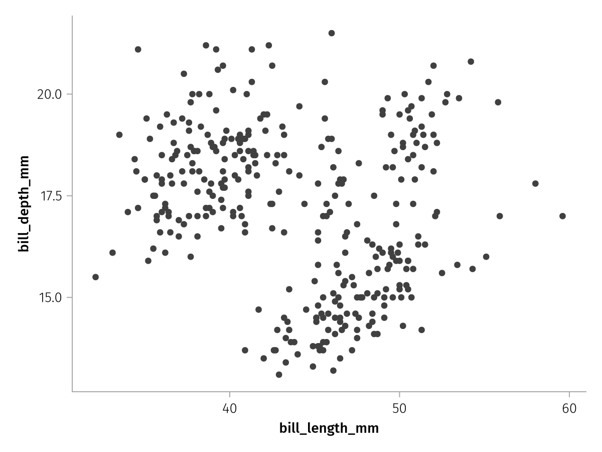
Ok, that worked, but why, and how?
We have just created a layer and then drawn it. Layers form the backbone of AoG plots. A layer combines the specification of three major components:
the input
dataa
mappingspecifying which parts of the input data should be used as the arguments of Makie plotting functions or AoG transformationsthe Makie plotting function used to visualize a layer's data (via
visual) or some othertransformationthat should be applied (think statistical transformation plus possibly multiplevisuals rolled into one)
For reference, an empty layer looks like this, it has no input data, no positional or named arguments which form the mapping, and the transformation which would take the mapped input data and turn it into a plot is identity, which doesn't do anything:
Layer()Layer
transformation: identity
data: Nothing
positional:
named:To specify the input data, we use the data function which creates a partially specified layer:
data(penguins)Layer
transformation: identity
data: AlgebraOfGraphics.Columns{DataFrames.DataFrameColumns{DataFrames.DataFrame}}
positional:
named:You can see that positional and named arguments are still unset, as is the transformation. The data component, however, reflects that we have added a DataFrame source.
Next, we need to specify which columns from our data source we want to use as arguments to our layer's plotting function, the scatter plot (which we have also not specified, yet). A Scatter plot in Makie takes x as the first positional argument and y as the second. So what do we want our x and y to be? Let's pick bill_length_mm as x and bill_depth_mm as y. We can express that using mapping:
mapping(:bill_length_mm, :bill_depth_mm)Layer
transformation: identity
data: Nothing
positional:
1: bill_length_mm
2: bill_depth_mm
named:By itself, mapping just creates a partial layer where, in our case, two positional arguments have been specified. But bill_length_mm and bill_depth_mm don't mean anything on their own, they have to be combined with our table source first. We can combine our partial layers with the * operator:
data(penguins) * mapping(:bill_length_mm, :bill_depth_mm)Layer
transformation: identity
data: AlgebraOfGraphics.Columns{DataFrames.DataFrameColumns{DataFrames.DataFrame}}
positional:
1: bill_length_mm
2: bill_depth_mm
named:So far this means "take the penguins data and map its two columns bill_length_mm and bill_depth_mm to the first two positional arguments of some yet to be specified function".
Now, we're just missing the information which plot type we want to use these two columns with. In our first example, we use Makie's Scatter plot type. Let's look at the partial layer that is created by visual, which has no data source and no positional or named arguments:
visual(Scatter)Layer
transformation: AlgebraOfGraphics.Visual(Scatter, {}, nothing)
data: Nothing
positional:
named:You can see that the transformation field has been set to a Visual object that specifies we want to use a Scatter plot. And now we combine all three parts, forming a fully specified layer:
layer = data(penguins) * mapping(:bill_length_mm, :bill_depth_mm) * visual(Scatter)Layer
transformation: AlgebraOfGraphics.Visual(Scatter, {}, nothing)
data: AlgebraOfGraphics.Columns{DataFrames.DataFrameColumns{DataFrames.DataFrame}}
positional:
1: bill_length_mm
2: bill_depth_mm
named:Note that Makie has many other plotting functions than Scatter, have a look at the Makie docs for an overview. Most of these work with AlgebraOfGraphics, although some have not been ported over, yet.
The draw function
Finally, we can turn our layer into Makie plot objects. This is done using the draw function. Contrary to the name, draw doesn't actually "draw" anything, that part is done by CairoMakie using the output from draw. Therefore, it could also be called turn_into_makie_plot or something like that.
Nevertheless, returning the output from draw in an environment that knows how to display Makie plots, will actually draw something for us, so let's do that now:
draw(layer)
Our first AlgebraOfGraphics plot!
Attributes for visual
We have successfully passed two columns from our dataset to Makie's scatter function, but other than that we have left everything at its default. Like in base Makie, we can use lots of attributes to change how plotting functions are rendered. For example, we can modify the marker, markersize, color or alpha attributes. Every keyword attribute that we could usually pass to scatter(...; ) in Makie (check the scatter docstring or its docs page), we can pass with AlgebraOfGraphics as well, via the visual function:
new_layer = layer * visual(marker = :rtriangle, markersize = 15, color = :teal, alpha = 0.3)
draw(new_layer)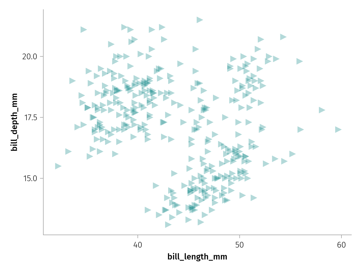
Note how we can just multiply these settings on top of our existing layer, the visual transformations are chained together. The first one will set the Scatter plot type and the second one will set the attributes.
Two useful attributes you can pass to visual which are not forwarded to the respective plotting function are label and legend. With label, we can give a layer a labeled legend entry and with legend we can pass override attributes for that entry, for example change the alpha of the legend marker:
new_layer_legend = new_layer * visual(label = "Penguins", legend = (; alpha = 1))
draw(new_layer_legend)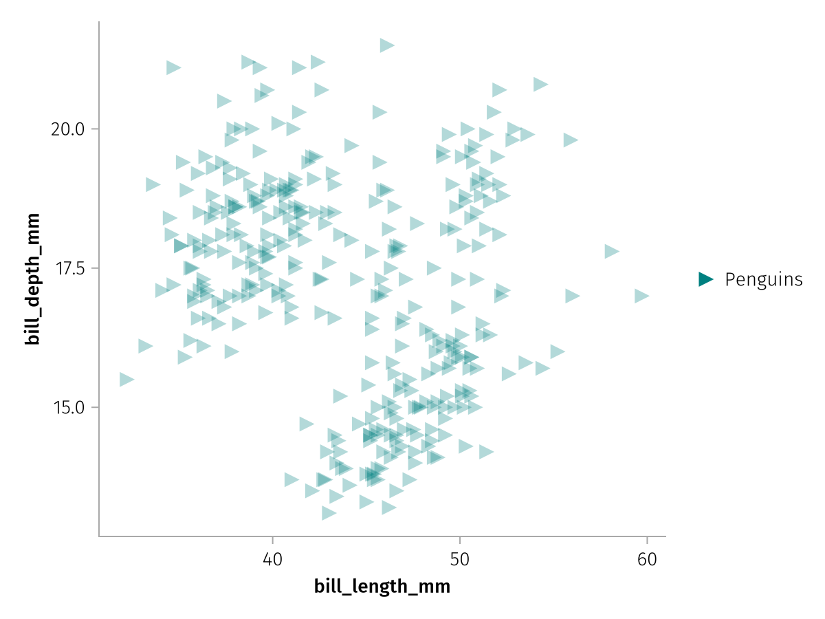
Continuous and categorical data
If we want to color the scatter markers given some input data, we have to add the color keyword to the mapping. We can either use continuous or categorical data for color, continuous data will get a Colorbar and categorical a Legend.
AlgebraOfGraphics treats numbers as continuous and almost everything else as categorical by default. We can use the column body_mass_g as a continuous and species as a categorical example.
Like before, we don't have to make a completely new layer, we can just merge the color mapping into the existing layer with *.
color_layer_continuous = layer * mapping(color = :body_mass_g)
draw(color_layer_continuous)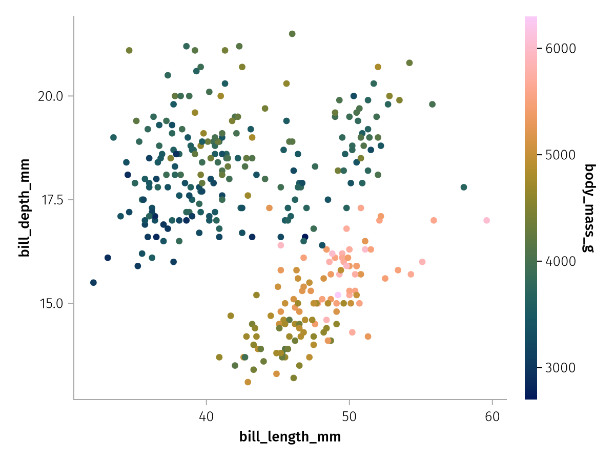
color_layer_categorical = layer * mapping(color = :species)
draw(color_layer_categorical)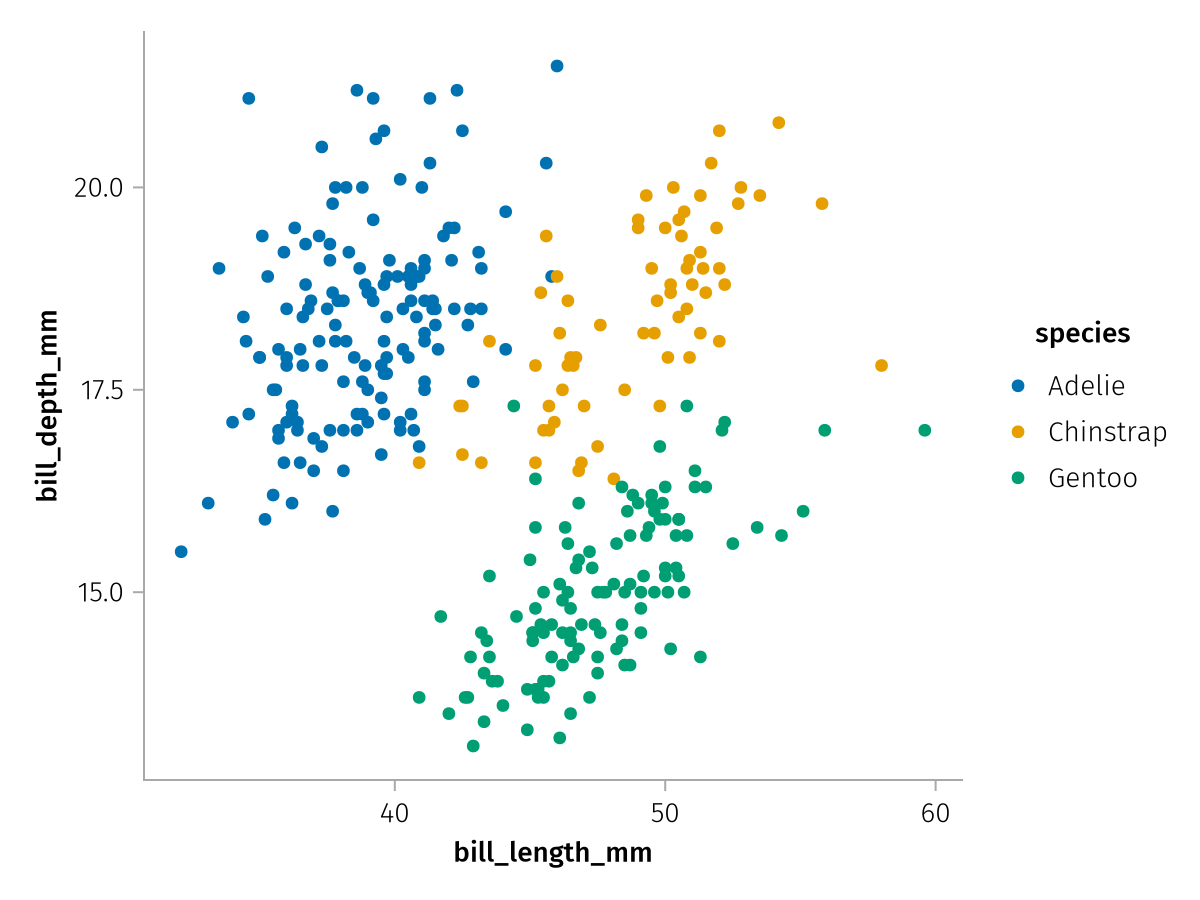
Transformations and analyses
As we've seen above, the visual function simply sets the transformation property of a layer to a Visual object, which passes the input data to a plain Makie plotting function without further modification.
That's the simplest kind of transformation, but there are others which actually do transform the input data. Examples for built-in transformations are the Analyses functions, one of which, the density() we will demonstrate here:
density_layer = data(penguins) * mapping(:bill_length_mm, :bill_depth_mm) * AlgebraOfGraphics.density()
draw(density_layer)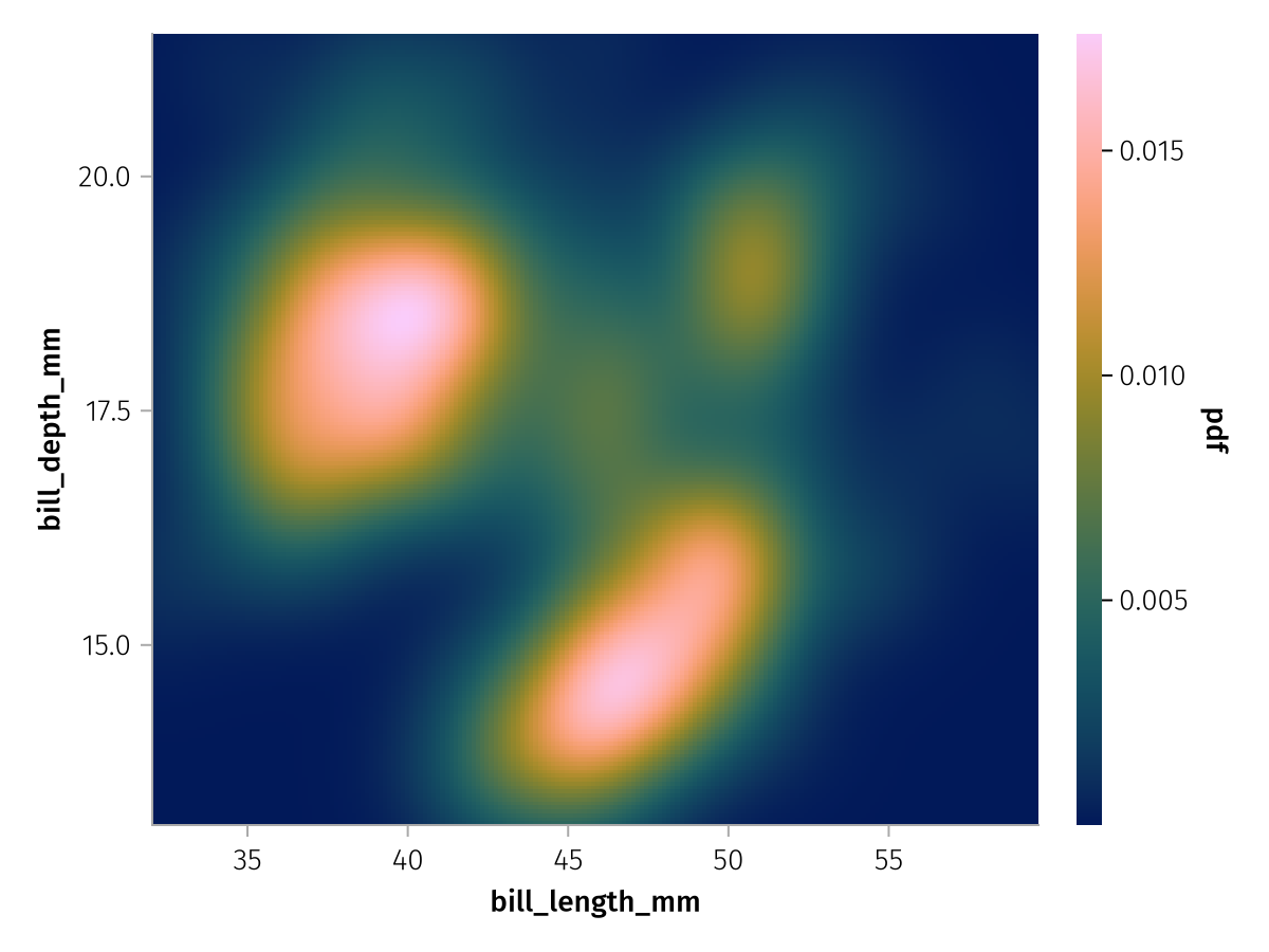
You can see that the density function resulted in a heatmap in which continuous color visualizes the probability density function or pdf of our data. For transformations that only create a single layer, like the heatmap here, we can sometimes conveniently switch out the plotting function that is used with transformed data, by multiplying with a visual that is compatible with the same arguments.
For example, we can use a contour plot instead of a heatmap because they are both specified with three positional arguments:
draw(density_layer * visual(Contour))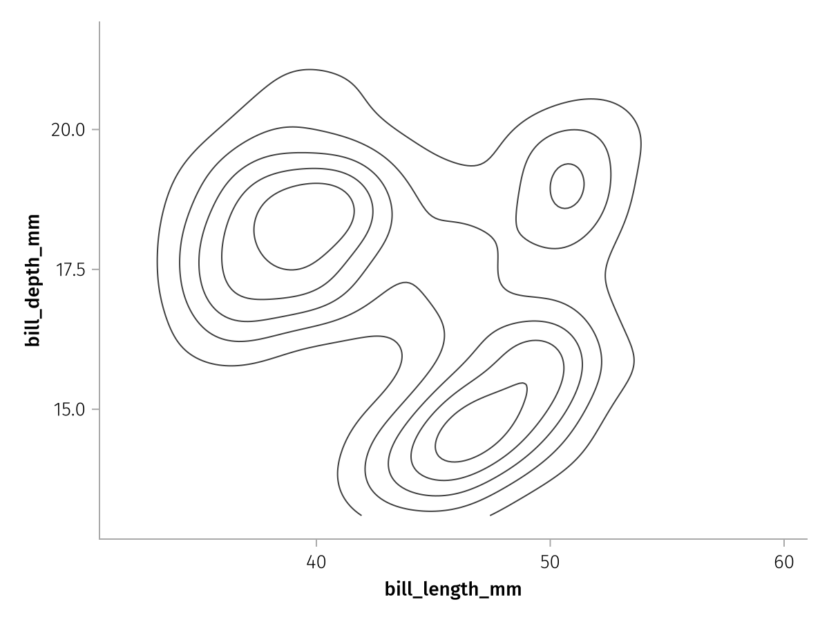
Stacking layers with +
So far we've only seen the * operator in use, the other operator that completes the algebra is + which stacks layers on top of each other. Often, multiple layers will share the same data and maybe even mapping, and in this case we can use the distributive law to simplify our code.
For example, note that our density contour and scatter plots used the same data and mapping components, so we can multiply them with a stack of contour and scatter to form two fully specified layers. First we create the two stacked partial layers:
contour_layer = AlgebraOfGraphics.density() * visual(Contour)
scatter_layer = AlgebraOfGraphics.visual(Scatter)
contour_plus_scatter = contour_layer + scatter_layer
Layers with 2 elements:
Layer 1
transformation: AlgebraOfGraphics.Visual(Contour, {}, nothing) ∘ AlgebraOfGraphics.DensityAnalysis{Makie.Automatic, Makie.Automatic, Makie.Automatic}(Makie.Automatic(), 200, Makie.Automatic(), Makie.Automatic(), Makie.Automatic())
data: Nothing
positional:
named:
Layer 2
transformation: AlgebraOfGraphics.Visual(Scatter, {}, nothing)
data: Nothing
positional:
named:You can see how the stacked layers don't have data, positional or named set, yet, only transformation. We can change that by multiplying with those missing components, and both layers will receive the same settings according to the distributive law:
complete_contour_plus_scatter = data(penguins) *
    mapping(:bill_length_mm, :bill_depth_mm, color = :species) *
    contour_plus_scatter
Layers with 2 elements:
Layer 1
transformation: AlgebraOfGraphics.Visual(Contour, {}, nothing) ∘ AlgebraOfGraphics.DensityAnalysis{Makie.Automatic, Makie.Automatic, Makie.Automatic}(Makie.Automatic(), 200, Makie.Automatic(), Makie.Automatic(), Makie.Automatic())
data: AlgebraOfGraphics.Columns{DataFrames.DataFrameColumns{DataFrames.DataFrame}}
positional:
1: bill_length_mm
2: bill_depth_mm
named:
color: species
Layer 2
transformation: AlgebraOfGraphics.Visual(Scatter, {}, nothing)
data: AlgebraOfGraphics.Columns{DataFrames.DataFrameColumns{DataFrames.DataFrame}}
positional:
1: bill_length_mm
2: bill_depth_mm
named:
color: speciesWhen we draw this stack, we see that each species has its own density contour and scatter cloud:
draw(complete_contour_plus_scatter)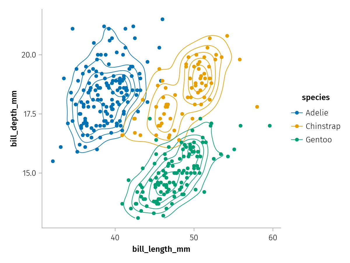
Aesthetics
Not every attribute that a Makie plotting function supports can be used inside mapping, for example, Scatter doesn't support mapping columns to the attributes glowcolor or alpha. In order to use a Makie plotting function with AlgebraOfGraphics, AoG has to be told which positional arguments and which keyword arguments correspond to which "aesthetics". Aesthetics in AlgebraOfGraphics are pretty similar to aes in ggplot2, they are abstractions of visual properties, like X, Y, Color or Marker, which tell AlgebraOfGraphics what labels and legends are appropriate when those aesthetics are used.
For example, here are the aesthetics AoG supports for the Scatter visual (the show_aesthetics function was added in version 0.11.2):
show_aesthetics(Scatter)Found 3 aesthetic mappings for `Scatter`:
With 1 positional argument:
- 1 (categorical/continuous) → Y
- color → Color
- strokecolor → Color
- marker → Marker
- markersize → MarkerSize
With 2 positional arguments:
- 1 (categorical/continuous) → X
- 2 (categorical/continuous) → Y
- color → Color
- strokecolor → Color
- marker → Marker
- markersize → MarkerSize
With 3 positional arguments:
- 1 (categorical/continuous) → X
- 2 (categorical/continuous) → Y
- 3 (categorical/continuous) → Z
- color → Color
- strokecolor → Color
- marker → Marker
- markersize → MarkerSizeYou can see that the first two positional arguments correspond to X and Y, and we could also use strokecolor, marker and markersize in a mapping. You can also see that color and strokecolor both correspond to the Color aesthetic because on some level they both influence the color of the plot, even though they do it in slightly different ways.
The first two arguments of a plotting function are not always X and Y, that depends on the implementation. A simple counterexample in Makie is Violin which can be vertical or horizontal, and which of the positional arguments is X and which is Y depends on the orientation. We can see that reflected in the aesthetic mapping of Violin:
show_aesthetics(Violin)Found 1 aesthetic mapping for `Violin`:
With 2 positional arguments:
- 1 (categorical/continuous) depends on orientation:
:horizontal → Y
:vertical → X
- 2 (categorical/continuous) depends on orientation:
:horizontal → X
:vertical → Y
- color → Color
- side → ViolinSide
- dodge depends on orientation:
:horizontal → DodgeY
:vertical → DodgeXYou can see that arguments 1, 2 as well as the keyword argument dodge change their aesthetics depending on the value of the orientation attribute. We can easily demonstrate the effect that this has on the axis labels:
violin_layer = data(penguins) * mapping(:species, :bill_length_mm) * visual(Violin)
draw(violin_layer)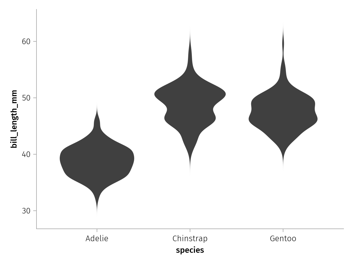
When we change the orientation to :horizontal, the X and Y axes switch places:
draw(violin_layer * visual(orientation = :horizontal))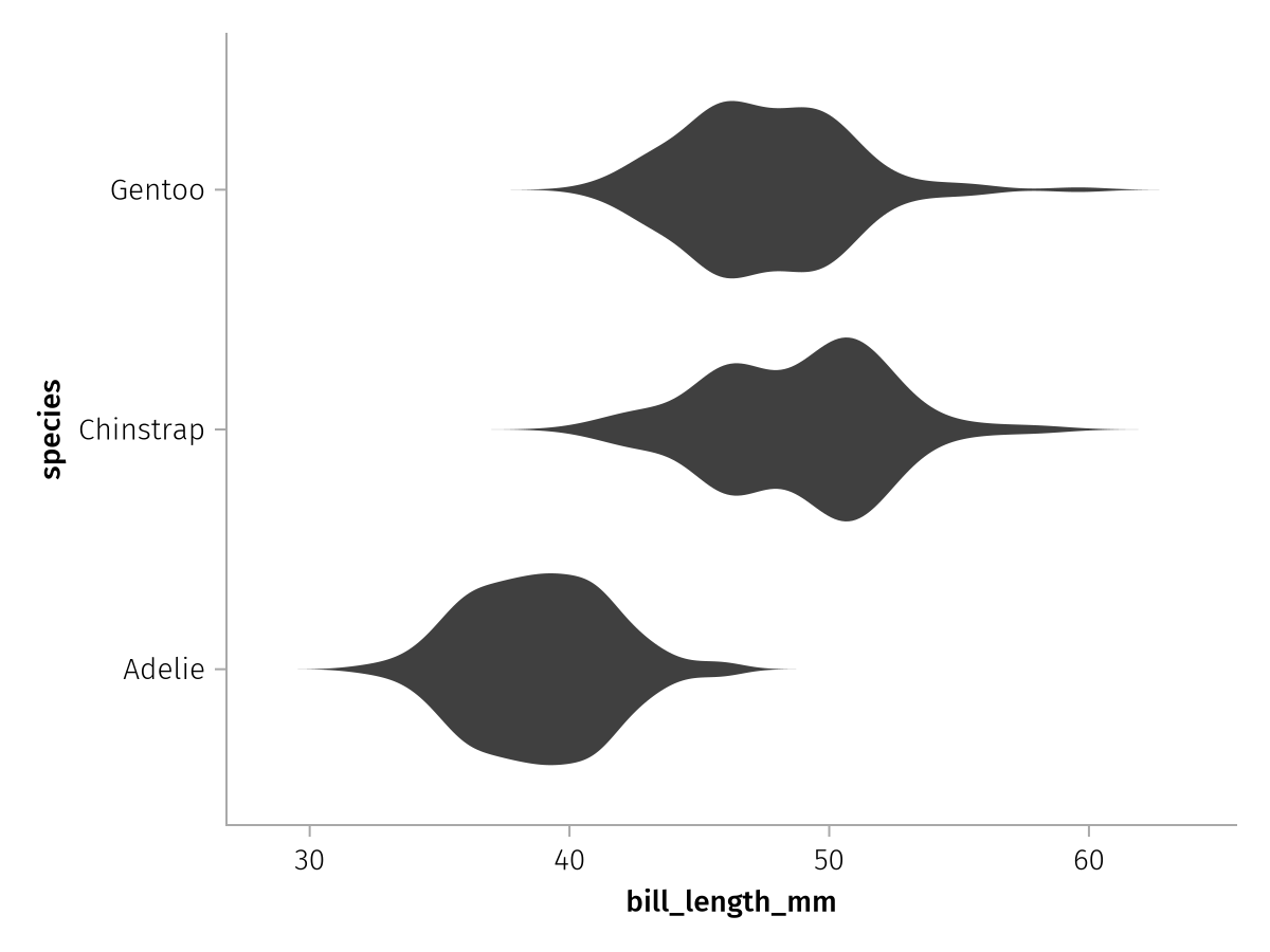
So AlgebraOfGraphics determines with the aesthetic mapping which arguments mapped to a plotting function correspond to which abstract visual property, and it decides what and where to label using that information.
Scales
Another important concept in AoG which is closely related to aesthetics are scales. A scale is basically the combination of an aesthetic with either categorical or continuous data. You can have a categorical Color scale, for example, or a continuous X scale. Not all combinations make sense, for example there can be no continuous Marker scale because markers are inherently categorical.
Scales decide on a higher level how a given aesthetic is visualized. For example, a categorical Color scale will compute a set of colors, one for each encountered category, and pass these on to the plotting functions. So the final visual output will always depend on the scale and the plotting function used.
Scale properties
Each scale computes its continuous or categorical transformations based on a bunch of properties which can be modified using the scales function. For example, we had seen a continuously colored scatter plot above:
draw(color_layer_continuous)
The most common thing to change in this case is the colormap that is being used. We can set a different colormap as one of the properties of the appropriate scale, in this case Color. Remember that color was mapped to the AesColor aesthetic for Scatter, we drop the Aes prefix that all aesthetics share and get the default scale identifier for this aesthetic.
draw(color_layer_continuous, scales(Color = (; colormap = :RdBu)))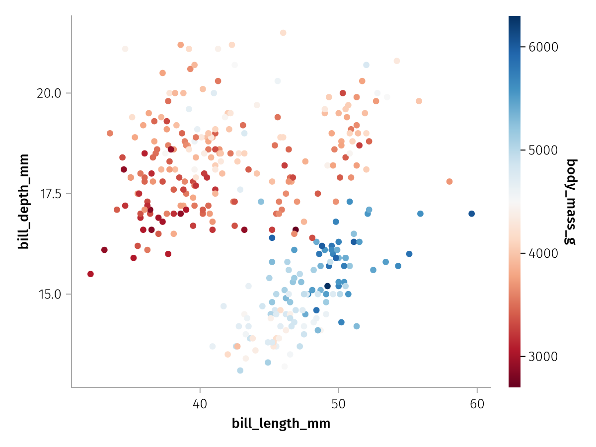
Another thing we can change for each scale is the label which will set the colorbar label for a continuous Color scale:
draw(color_layer_continuous, scales(Color = (; label = "Body mass (g)")))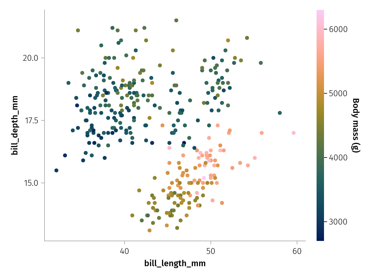
We can also label the X and Y scales this way:
draw(
    color_layer_continuous,
    scales(
        Color = (; label = "Body mass (g)"),
        X = (; label = "Bill length (mm)"),
        Y = (; label = "Bill depth (mm)"),
    ),
)
Categorical scales and merging
One important aspect of scales is the fact that they are always fit to all data across the different layers that belongs to the same aesthetic (with some exceptions you will learn about later). For example, if you combine two layers that use different categorical data for the Color aesthetic, the final scale will reflect the merged set of categories.
For this synthetic example, we make a second dataframe with one group of penguins removed:
penguins_no_adelie = subset(penguins, :species => ByRow(!=("Adelie")))

shared_mapping = mapping(:bill_length_mm, :bill_depth_mm, color = :species)
contour_layer = data(penguins) * shared_mapping * AlgebraOfGraphics.density() * visual(Contour)
no_adelie_scatter_layer = data(penguins_no_adelie) * shared_mapping * visual(Scatter)
draw(contour_layer + no_adelie_scatter_layer)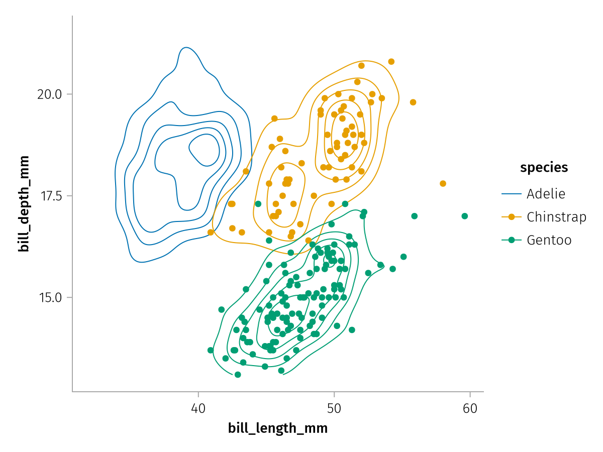
Even though the Scatter layer only directly sees Chinstrap and Gentoo penguins, a single color scale is merged across layers so that the colors for both plots match.
If the reduced scatter layer is drawn on its own, you can see that the colors are assigned differently:
draw(no_adelie_scatter_layer)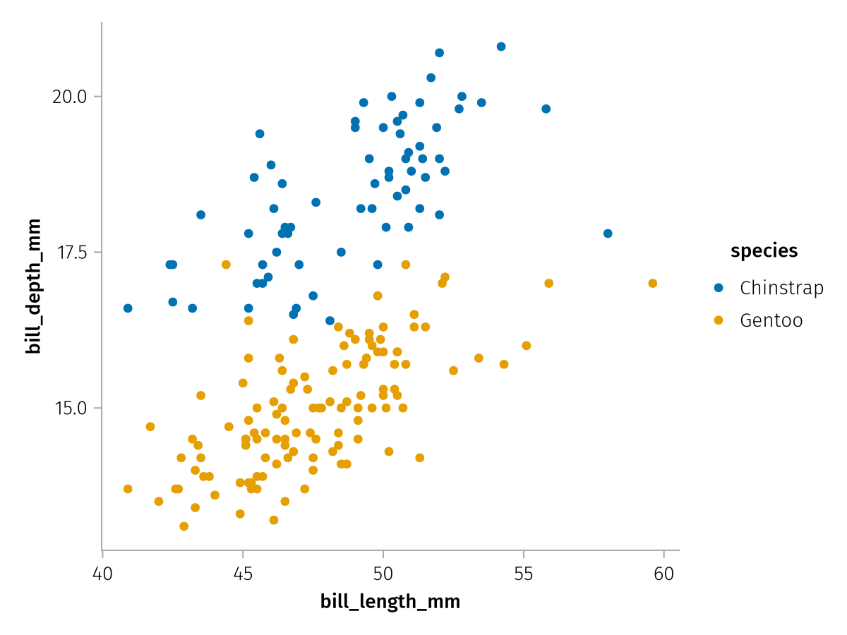
Categorical palettes
A categorical scale usually accepts a palette keyword which specifies the set of values to pick from when assigning each category a different aesthetic value. The kinds of palettes you can specify differ between the aesthetics. Categorical colors, for example, can be specified using a vector of colors:
draw(color_layer_categorical, scales(Color = (; palette = [:tomato, :teal, :orange])))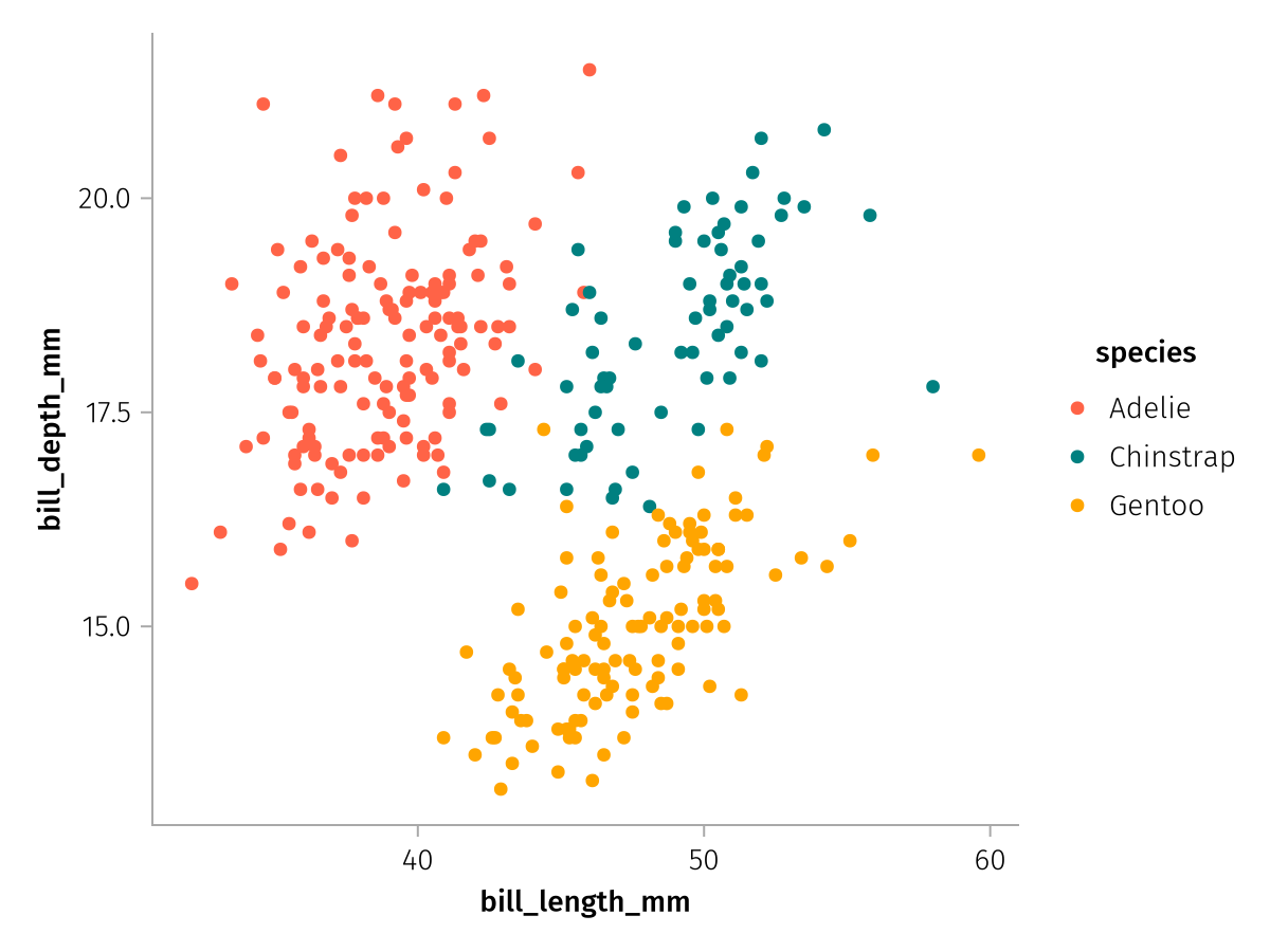
Or one of Makie's predefined categorical colormaps:
draw(color_layer_categorical, scales(Color = (; palette = :Set1_3)))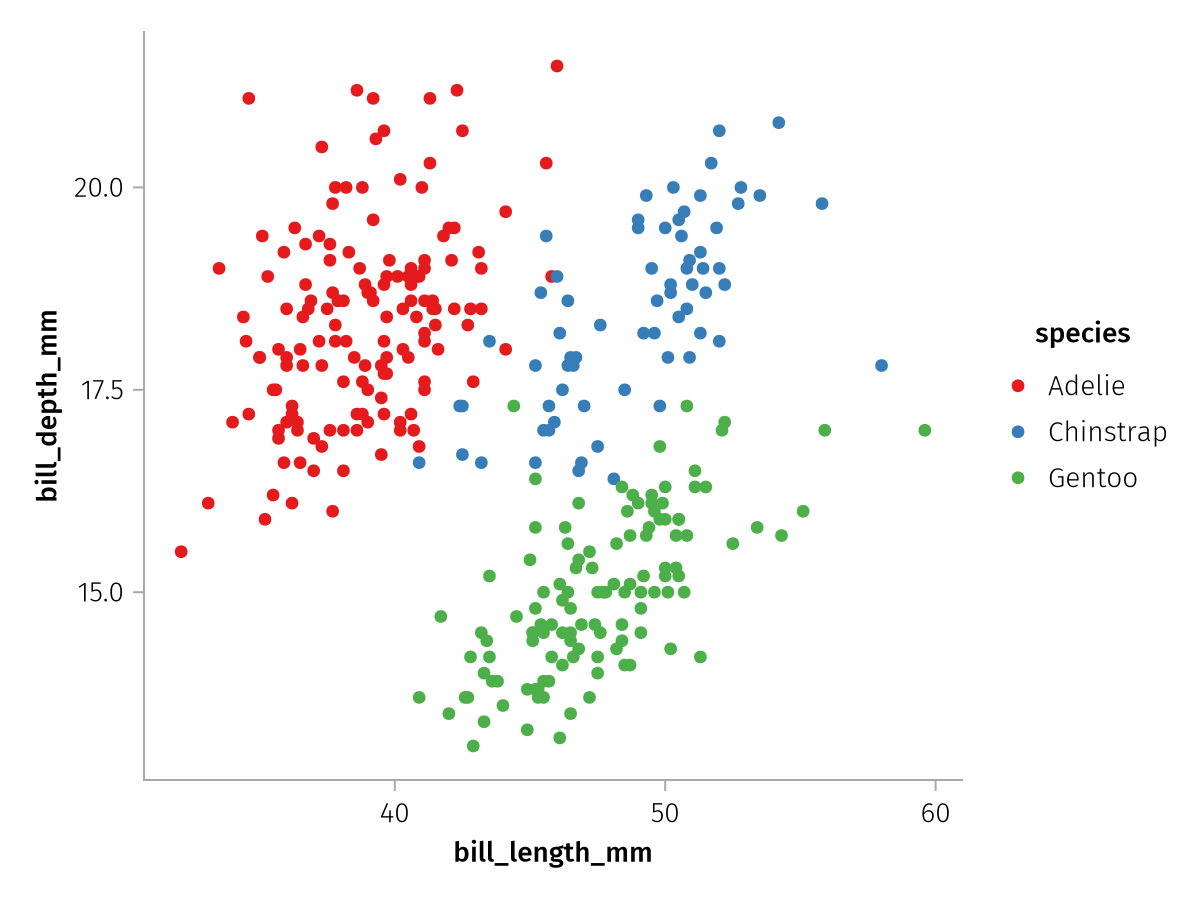
Or a continuous colormap that is sampled end-to-end:
draw(color_layer_categorical, scales(Color = (; palette = from_continuous(:viridis))))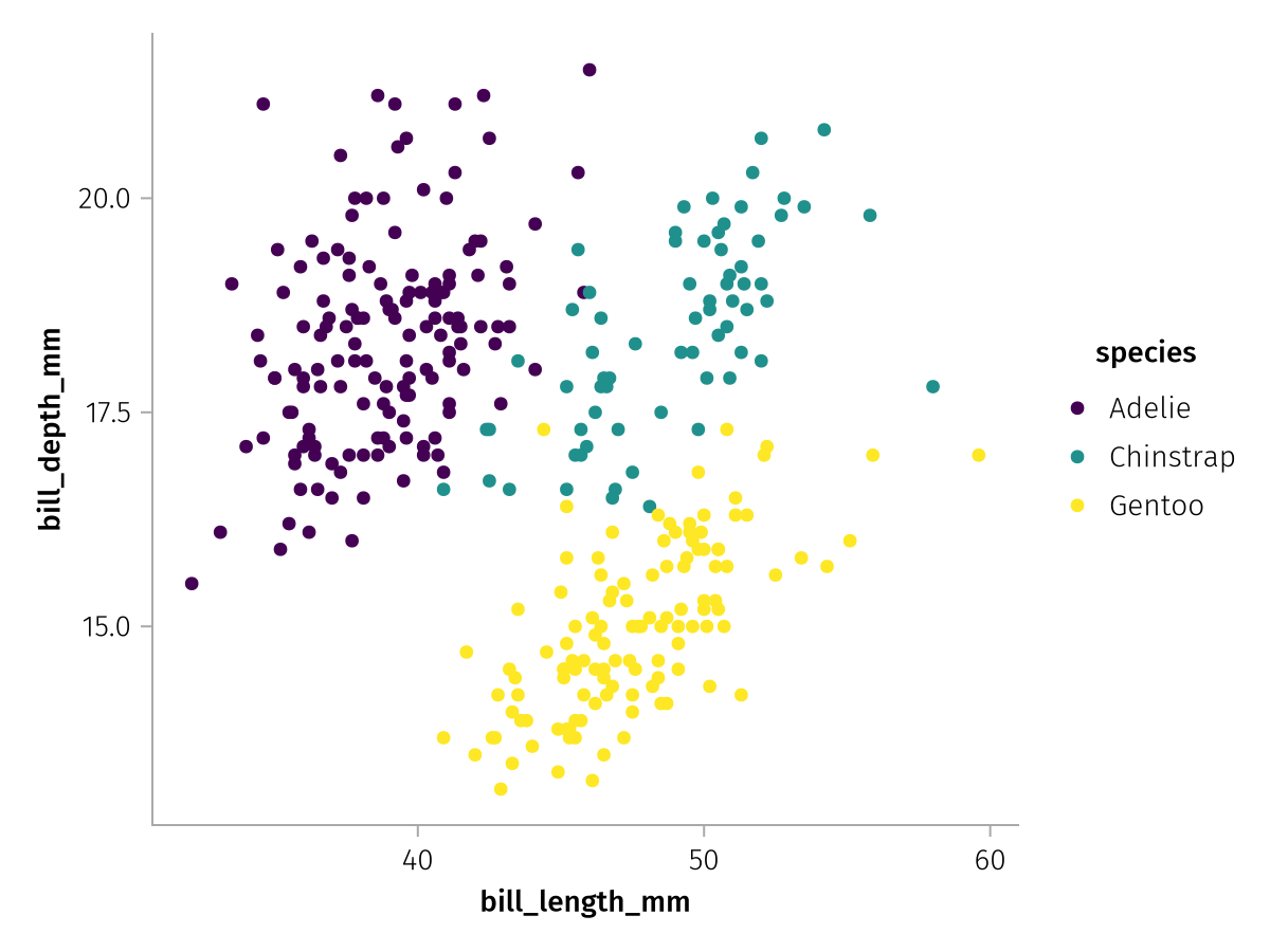
Shortcut: Labels in mapping
For quick plotting, it can be inconvenient to pass labels separately via the scales function. This is why there's an alternative way to set labels, by pairing them directly to their column selectors within mapping:
layer = data(penguins) *
    mapping(
        :bill_length_mm => "Bill length (mm)",
        :bill_depth_mm => "Bill depth (mm)",
        color = :species => "Species",
    ) *
    visual(Scatter)
draw(layer)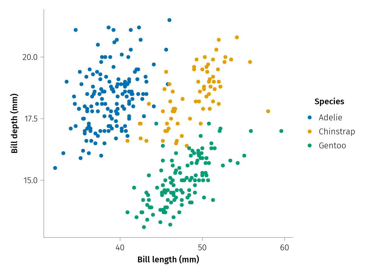
Note that if there are multiple layers and different layers have different labels for the same scale, either because the column names or the paired labels don't match, the resulting label will be empty. In those cases it is again more convenient to assign a central label in the scales rather than affixing the same ones to each layer's mapping entries.
Summary
This concludes the first tutorial. You have learned about the fundamental concepts of layers, aesthetics and scales, and how they come together to create AlgebraOfGraphics visualizations. In the following tutorials, we will go into each of these aspects in more detail.