Drawing Layers
A AlgebraOfGraphics.Layer or AlgebraOfGraphics.Layers object can be plotted using the functions draw or draw!.
Whereas draw automatically adds colorbar and legend, draw! does not, as it would be hard to infer a good default placement that works in all scenarios.
Colorbar and legend, should they be necessary, can be added separately with the colorbar! and legend! helper functions. See also TODO REFLINK Nested layouts for a complex example.
Scale options
All properties that decide how scales are visualized can be modified by passing scale options (using the scales function) as the second argument of draw . The properties that are accepted differ depending on the scale aesthetic type (for example Color, Marker, LineStyle) and whether the scale is categorical or continuous.
Shared categorical scale options
All categorical scales share the following options: - legend - palette - categories
legend
Setting legend = false hides the legend for the respective scale. For Row, Col and Layout this refers to the facet labels.
using AlgebraOfGraphics
using CairoMakie

spec = data((; x = 1:9, y = 1:9, group = repeat(["A", "B", "C"], inner = 3))) *
    mapping(:x, :y, color = :group, marker = :group) *
    visual(Scatter)

f = Figure()

fg1 = draw!(f[1, 1], spec, scales(Color = (; legend = false)))
legend!(f[1, 2], fg1)

fg2 = draw!(f[2, 1], spec, scales(Marker = (; legend = false)))
legend!(f[2, 2], fg2)

f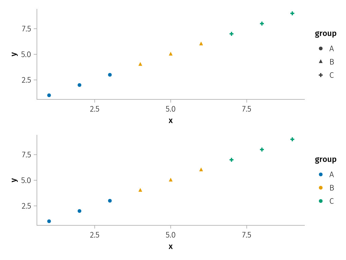
hide_unused_legend
By default, a legend entry's element for a given plot type is hidden if that plot type has no data for the entry's category. Setting hide_unused_legend = false disables this for a specific scale, which can be useful if a plot type should appear in the legend even without data.
This behavior can also be controlled globally via legend = (; hide_unused = ...) in draw. See hide_unused for a visual example.
palette
Each categorical scale has a palette which assigns an attribute value to each data value in the scale. For example, a categorical color scale might assign the color :red to the value "A", :blue to "B" and so on.
The most basic kind of palette is simply a vector of values. Each scale value is assigned one palette entry in order, if there are fewer palette entries than scale values the palette is cycled.
using AlgebraOfGraphics
using CairoMakie

f = Figure()
spec = mapping(1:5, 1:5, color = ["E", "D", "C", "B", "A"])
fg1 = draw!(
    f[1, 1], spec, scales(Color = (; palette = [:red, :blue, :green, :orange, :pink])),
    axis = (; title = "palette = [:red, :blue, :green, :orange, :pink]")
)
legend!(f[1, 2], fg1)
fg2 = draw!(
    f[2, 1], spec, scales(Color = (; palette = [:red, :blue])),
    axis = (; title = "palette = [:red, :blue]")
)
legend!(f[2, 2], fg2)
f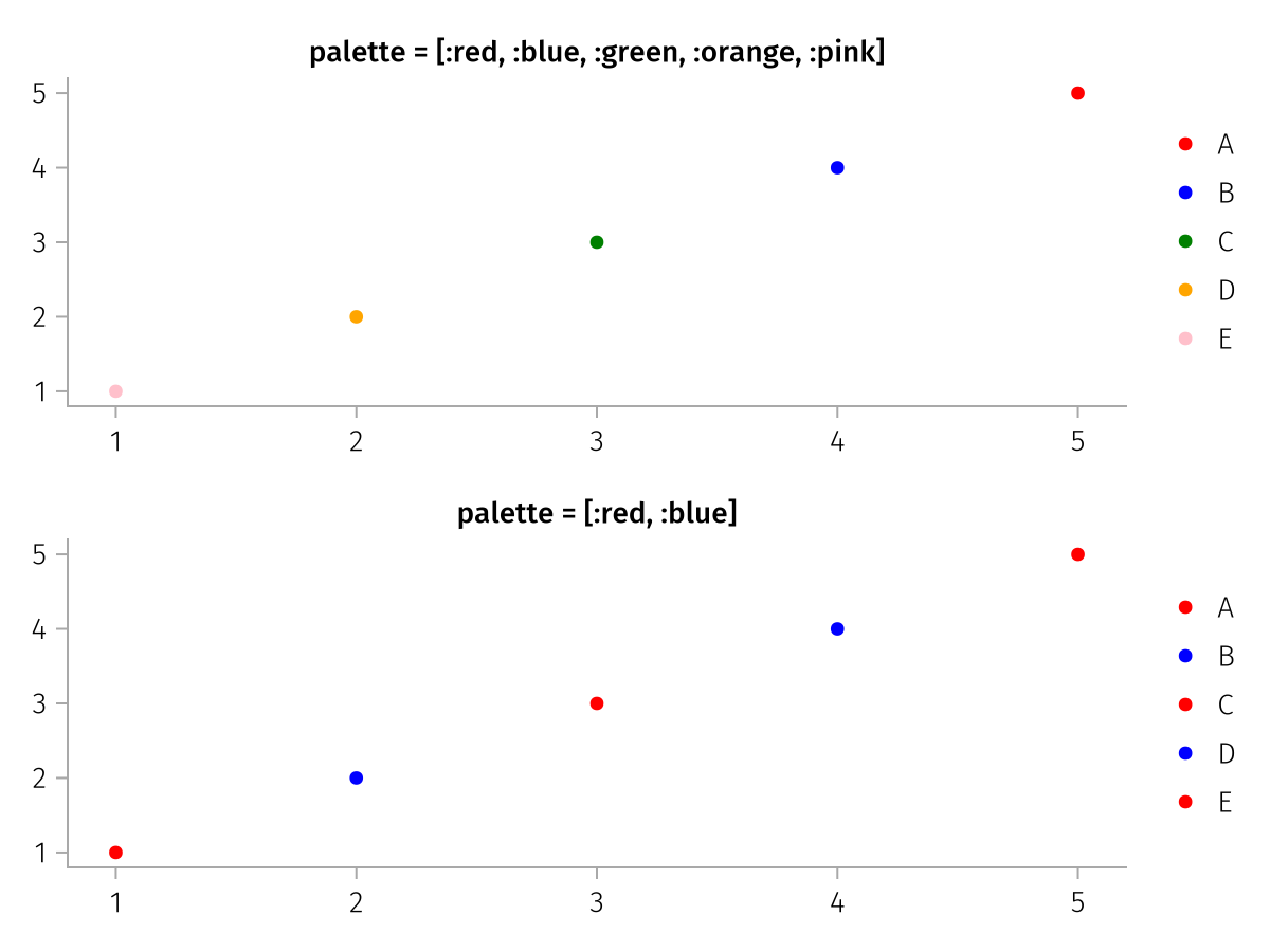
If you want to make sure that some categorical values receive specific palette values, no matter where in the categorical scale they are ordered, you can add these as paired elements to the palette vector. The unpaired palette values are then distributed between the remaining categorical values. This feature is primarily useful when creating multiple figures with different datasets that share some categories which should be colored consistently.
using AlgebraOfGraphics
using CairoMakie

f = Figure()
spec = mapping(1:5, 1:5, color = ["E", "D", "C", "B", "A"])
fg1 = draw!(
    f[1, 1], spec, scales(Color = (; palette = [:red, :blue, :green, :orange, "A" => :cyan])),
    axis = (; title = "palette = [:red, :blue, :green, :orange, \"A\" => :cyan]")
)
legend!(f[1, 2], fg1)
fg2 = draw!(
    f[2, 1], spec, scales(Color = (; palette = [:red, :blue, "A" => :cyan])),
    axis = (; title = "palette = [:red, :blue, \"A\" => :cyan]")
)
legend!(f[2, 2], fg2)
f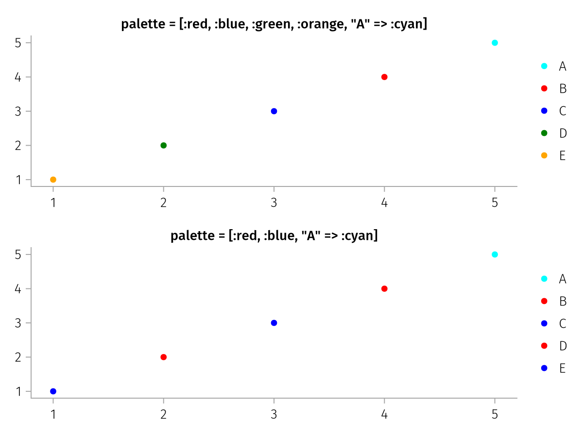
Some categorical scale types support palette types other than vectors. A few examples are shown in the following subsections.
Color
A Symbol is converted to a colormap with Makie.to_colormap.
using AlgebraOfGraphics
using CairoMakie

spec = data((; x = 1:10, y = 1:10, z = 'A':'J')) *
    mapping(:x, :y, color = :z) *
    visual(BarPlot)
draw(spec, scales(Color = (; palette = :tab10)))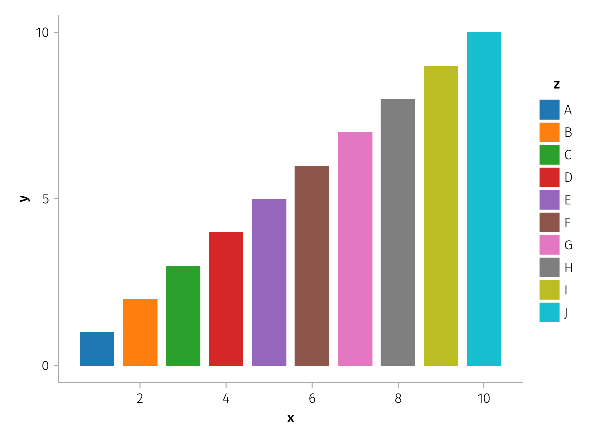
It's also possible to directly specify a vector of colors, each of which Makie.to_color can handle:
using AlgebraOfGraphics
using CairoMakie
using CairoMakie.Colors: RGB, RGBA, Gray, HSV

spec = data((; x = 1:10, y = 1:10, z = 'A':'J')) *
    mapping(:x, :y, color = :z) *
    visual(BarPlot)
draw(spec, scales(Color = (; palette = [:red, :green, :blue, RGB(1, 0, 1), RGB(1, 1, 0), "#abcff0", "#c88cbccc", HSV(0.9, 0.3, 0.7), RGBA(0.7, 0.9, 0.6, 0.5), Gray(0.5)])))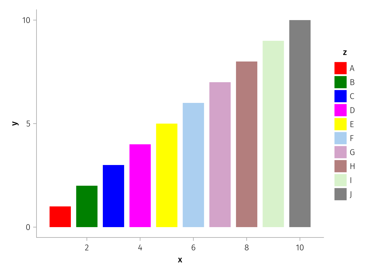
If you want to use a continuous colormap for categorical data, you can use the from_continuous helper function. It automatically takes care that the continuous colormap is sampled evenly from start to end depending on the number of categories. Any colormap that Makie understands can be passed, including named colormaps such as :viridis.
This example shows the difference in behavior when the two-element colormap [:red, :blue] is used with or without from_continuous:
using AlgebraOfGraphics
using CairoMakie

spec = data((; x = 1:10, y = 1:10, z = 'A':'J')) *
    mapping(:x, :y, color = :z) *
    visual(BarPlot)

f = Figure()
fg1 = draw!(f[1, 1], spec, scales(Color = (; palette = [:red, :blue])))
legend!(f[1, 2], fg1)
fg2 = draw!(f[1, 3], spec, scales(Color = (; palette = from_continuous([:red, :blue]))))
legend!(f[1, 4], fg2)
f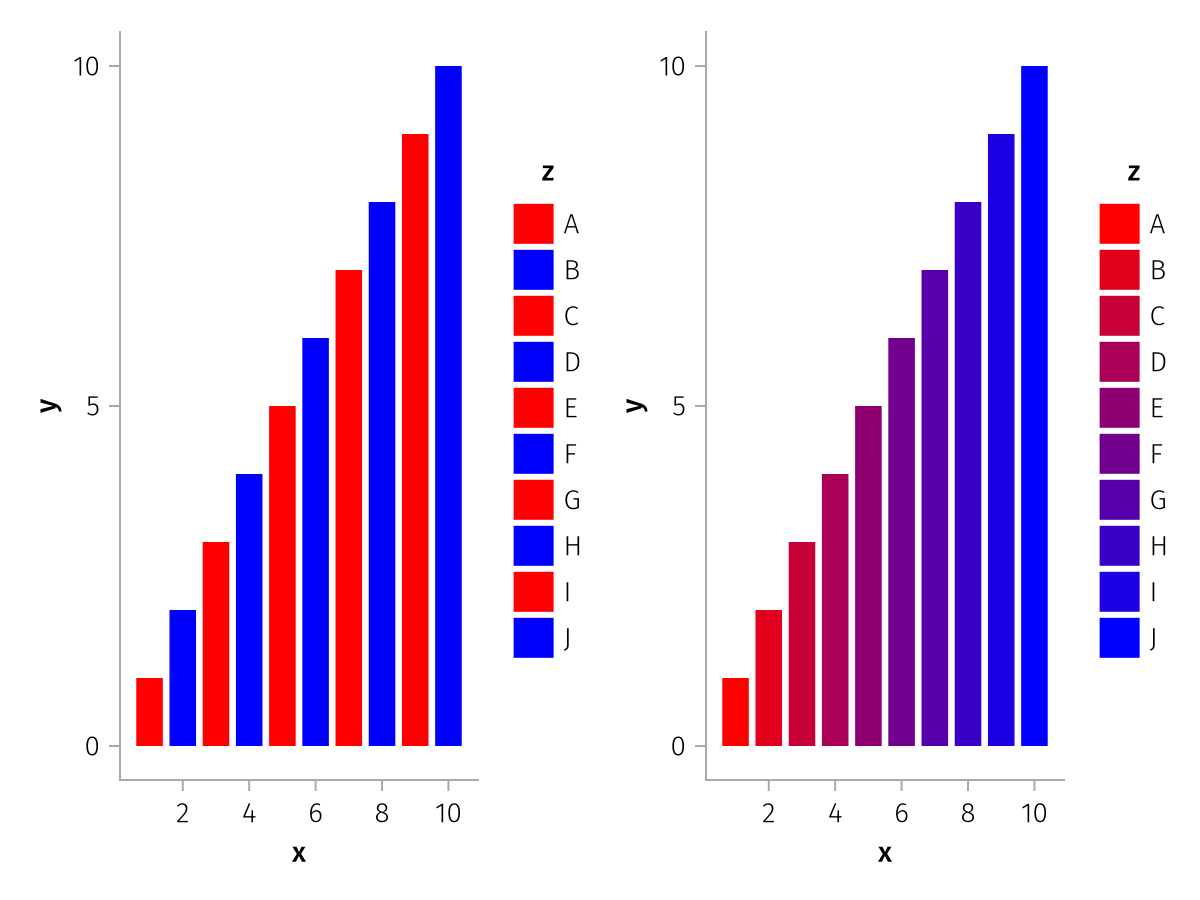
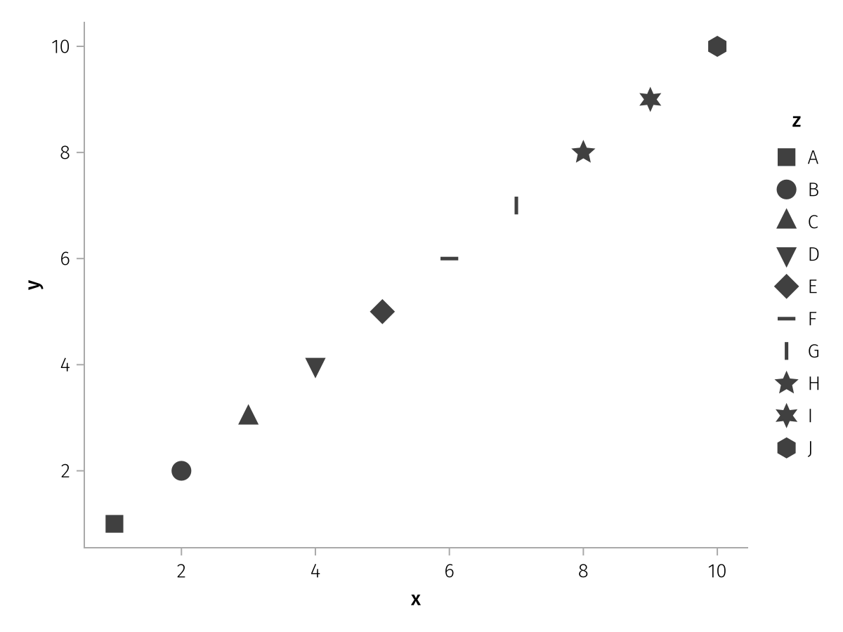
Marker
A vector of values that Makie.to_spritemarker can handle.
using AlgebraOfGraphics
using CairoMakie

spec = data((; x = 1:10, y = 1:10, z = 'A':'J')) *
    mapping(:x, :y, marker = :z) *
    visual(Scatter, markersize = 20)

draw(
    spec,
    scales(
        Marker = (; palette = [:rect, :circle, :utriangle, :dtriangle, :diamond, :hline, :vline, :star5, :star6, :hexagon])
    )
)
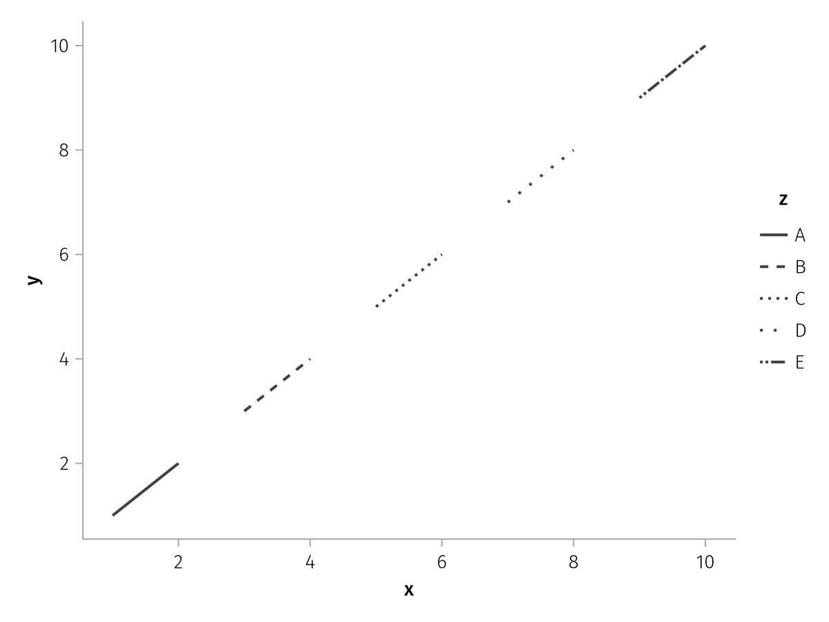
LineStyle
A vector of values that Makie.to_linestyle can handle.
using AlgebraOfGraphics
using CairoMakie

spec = data((; x = 1:10, y = 1:10, z = repeat('A':'E', inner = 2))) *
    mapping(:x, :y, linestyle = :z) *
    visual(Lines, linewidth = 2)

draw(spec, scales(
    LineStyle = (; palette = [:solid, :dash, :dot, (:dot, :loose), Linestyle([0, 1, 2, 3, 4, 8])])
))
X & Y
The "palette" values for X and Y axes are by default simply the numbers from 1 to N, the number of categories. In some circumstances, it might be useful to change these values, for example to visualize that one category is different than others. The palette values are normally assigned category-by-category in the sorted order, or in the order provided manually through the categories keyword. However, if you pass a vector of values, you can always use the category => value pair option to assign a specific category directly to a value, while the others cycle. Here, we do this with "Unknown" as it would otherwise be sorted before "X".
using AlgebraOfGraphics
using CairoMakie

df = (; group = ["A", "B", "C", "X", "Y", "Unknown"], count = [45, 10, 20, 32, 54, 72])

spec = data(df) * mapping(:group, :count) * visual(BarPlot)

draw(spec, scales(X = (; palette = [1, 2, 3, 5, 6, "Unknown" => 8])))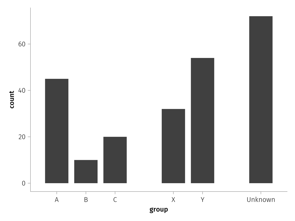
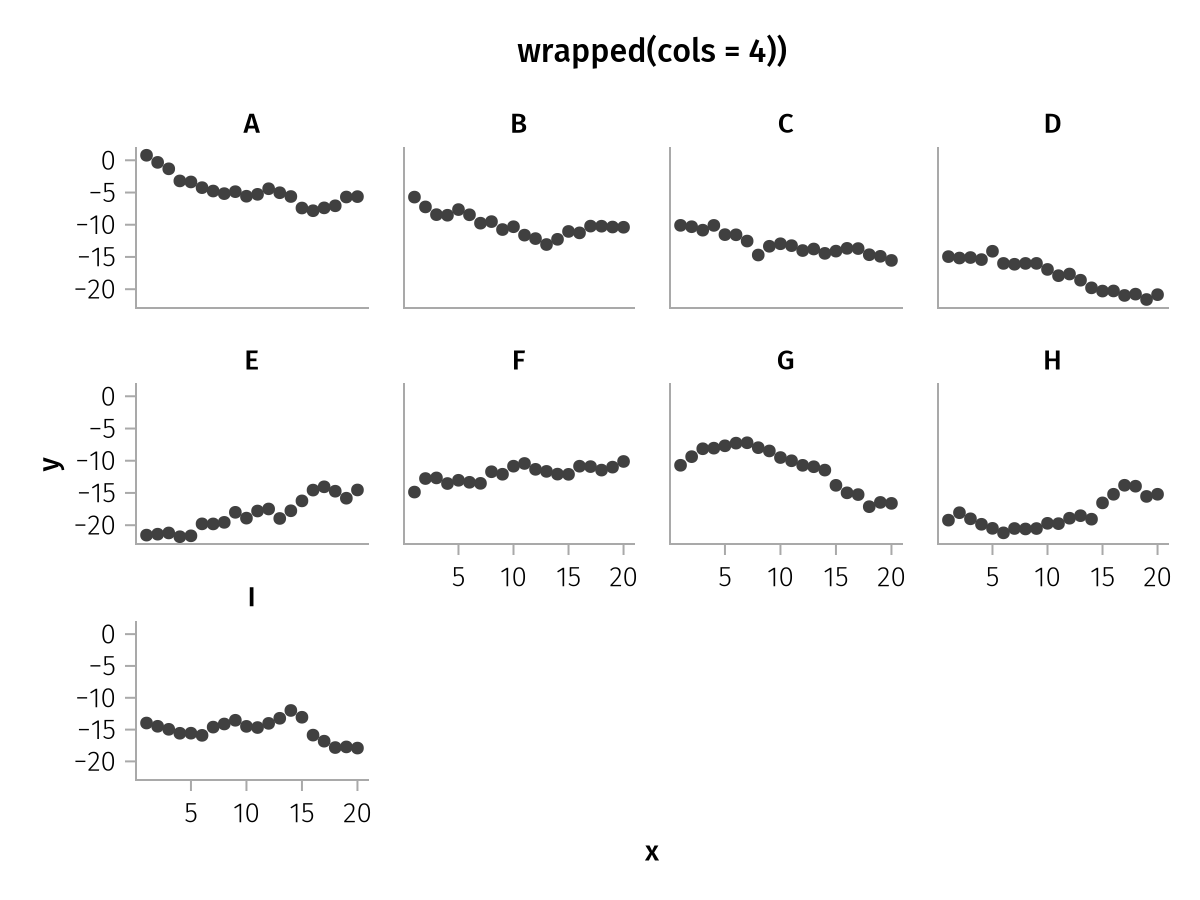
Layout
Normally, with the Layout aesthetic, rows wrap automatically such that an approximately square distribution of facets is attained. The wrapped function is a convenient helper to control the shape of the layout. You can control the maximum rows or columns, and the direction in which the layout is filled, which is row-by-row by default.
Here we cap the number of columns and leave the order by row:
using AlgebraOfGraphics
using CairoMakie

df = (;
    group = repeat(["A", "B", "C", "D", "E", "F", "G", "H", "I"], inner =20),
    x = repeat(1:20, 9),
    y = cumsum(randn(180)),
)

spec = data(df) * mapping(:x, :y, layout = :group) * visual(Scatter)

draw(spec, scales(Layout = (; palette = wrapped(cols = 4)));
    figure = (; title = "wrapped(cols = 4))", titlealign = :center)
)
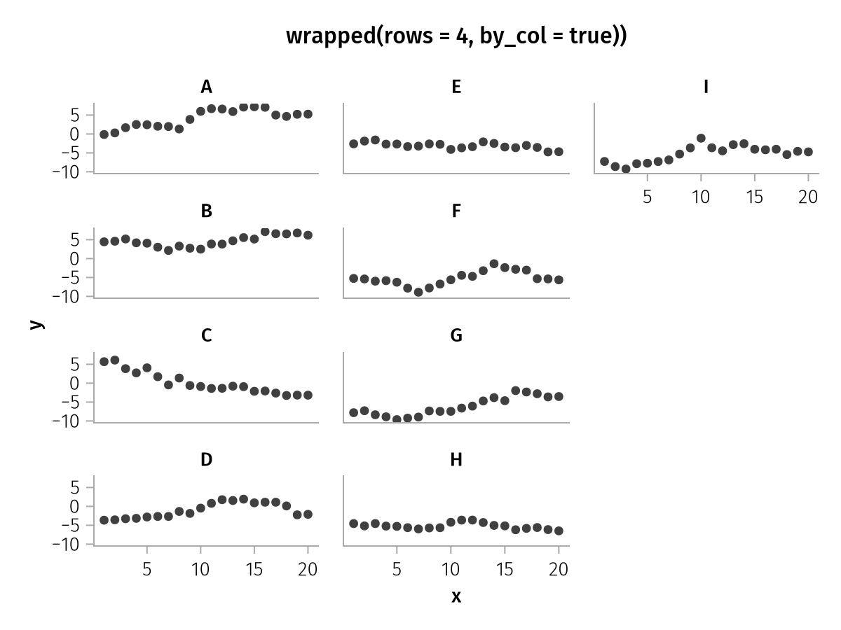
Here we cap the number of rows instead and change the order with by_col:
using AlgebraOfGraphics
using CairoMakie

df = (;
    group = repeat(["A", "B", "C", "D", "E", "F", "G", "H", "I"], inner =20),
    x = repeat(1:20, 9),
    y = cumsum(randn(180)),
)

spec = data(df) * mapping(:x, :y, layout = :group) * visual(Scatter)

draw(spec, scales(Layout = (; palette = wrapped(rows = 4, by_col = true)));
    figure = (; title = "wrapped(rows = 4, by_col = true))", titlealign = :center)
)
You can also pass completely custom positions as a vector of tuples (you could also compute these values on the fly by passing a Function to palette):
using AlgebraOfGraphics
using CairoMakie

df = (;
    group = repeat(["A", "B", "C", "D", "E", "F", "G", "H"], inner =20),
    x = repeat(1:20, 8),
    y = cumsum(randn(160)),
)

spec = data(df) * mapping(:x, :y, layout = :group) * visual(Scatter)

clockwise = [(1, 1), (1, 2), (1, 3), (2, 3), (3, 3), (3, 2), (3, 1), (2, 1)]

draw(spec, scales(Layout = (; palette = clockwise)))
categories
The categories keyword can be used to reorder, label and even add categorical values.
Some reordering and renaming can be done using the sorter and renamer helper functions applied directly to columns in mapping. However, this works less well when several data sources are combined where not all categories appear in each column. Also, no categories can be added this way, which is something that can be useful if the existence of categories should be shown even though there is no data for them.
New labels can be assigned using the value => label pair syntax.
using AlgebraOfGraphics
using CairoMakie

spec = data((; group = ["A", "C", "D"], value = [1, 3, 4])) *
    mapping(:group, :value) * visual(BarPlot)

f = Figure()

draw!(f[1, 1], spec, scales(
    X = (; categories = ["A", "B", "C", "D"])
))
draw!(f[1, 2], spec, scales(
    X = (; categories = ["D", "A", "C"])
))
draw!(f[1, 3], spec, scales(
    X = (; categories = ["A" => "a", "C" => "c", "D" => "d"])
))

f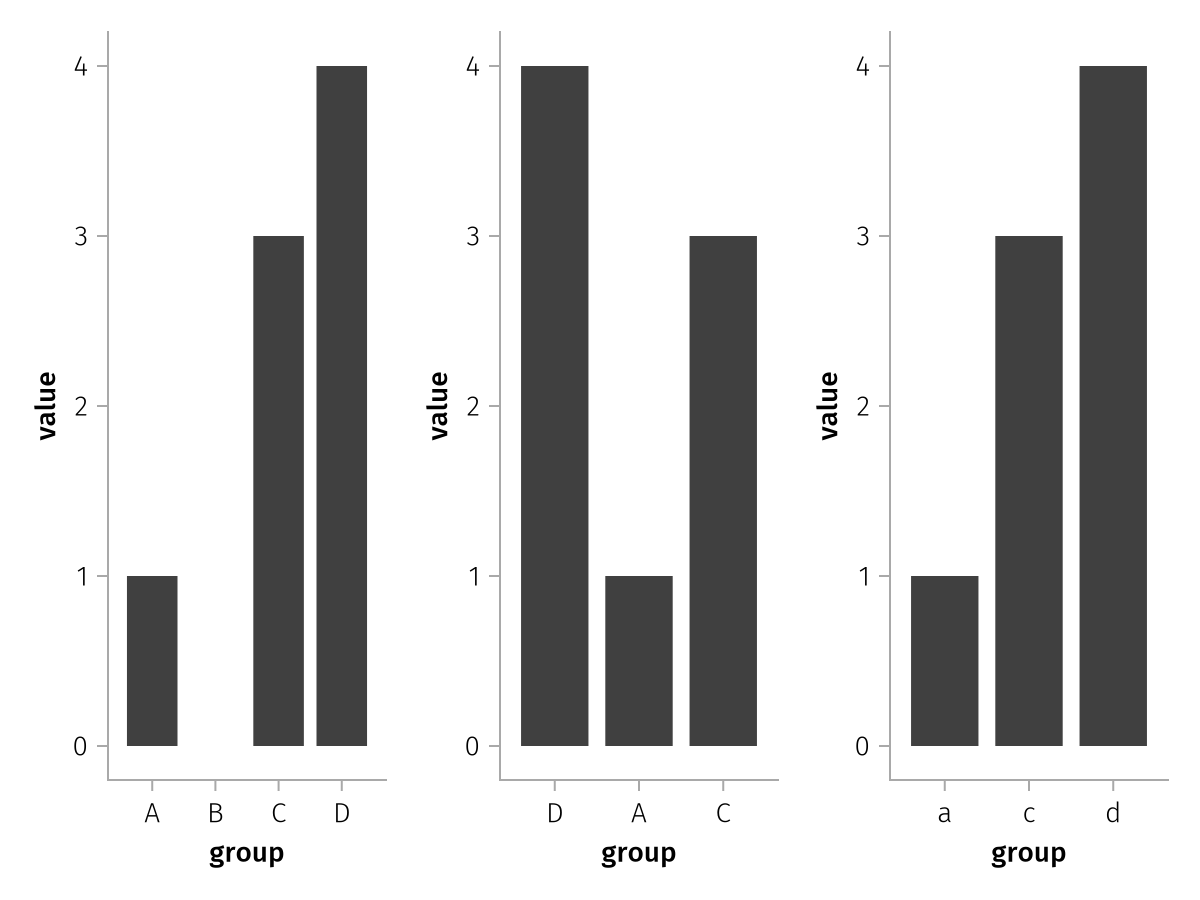
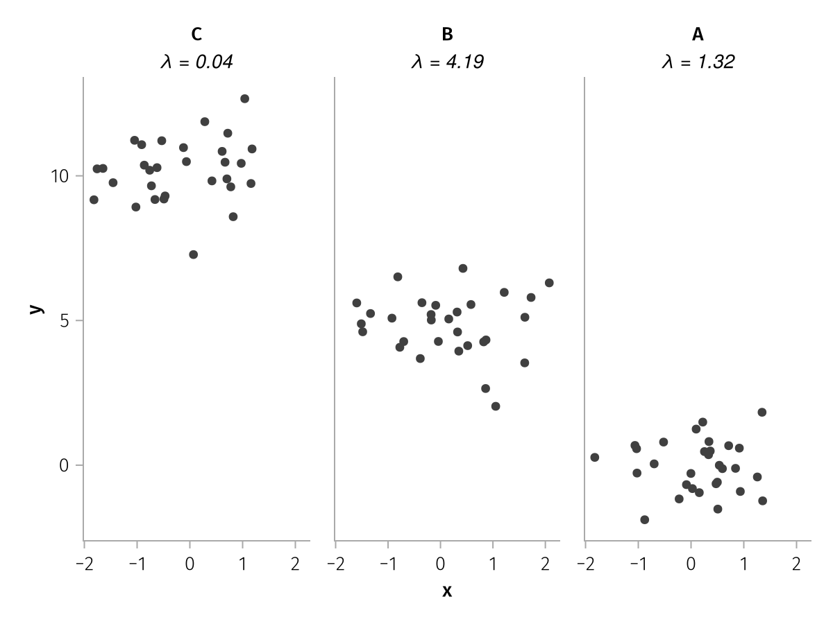
You can also pass a Function to categories which should take the vector of category values and return a new vector of categories or category/label pairs.
For example, you could add summary statistics to the facet layout titles this way, by grabbing them from a dictionary computed separately.
using AlgebraOfGraphics
using CairoMakie

summary_stats = Dict("A" => 1.32, "B" => 4.19, "C" => 0.04)

df = (;
    x = randn(90),
    y = randn(90) .+ repeat([0, 5, 10], inner = 30),
    group = repeat(["A", "B", "C"], inner = 30)
)

spec = data(df) * mapping(:x, :y, col = :group) * visual(Scatter)

draw(spec, scales(Col = (;
    categories = cats -> [
        cat => rich("$cat\n", rich("λ = $(summary_stats[cat])", font = :italic))
            for cat in reverse(cats)
        ]
)))
Special categorical scale options
Color
colorbar
The colorbar property is automatic by default and can be set to true or false. In automatic mode, a colorbar is used for categorical scales with datavalues of type Bin, and a legend for all other datavalues. The filled_contours analysis is an example function that uses a Bin categorical scale and therefore receives a Colorbar reflecting the selected levels:
using AlgebraOfGraphics
using CairoMakie
using DelimitedFiles
volcano = DelimitedFiles.readdlm(Makie.assetpath("volcano.csv"), ',', Float64)

x = repeat(range(3, 17, length = size(volcano, 1)), size(volcano, 2))
y = repeat(range(52, 79, length = size(volcano, 2)), inner = size(volcano, 1))
z = vec(volcano)

contour_spec = data((; x, y, z)) *
    mapping(:x, :y, :z) *
    filled_contours(levels = [120, 140, 160, 170, 175, 180, 185, 190, Inf])

draw(contour_spec)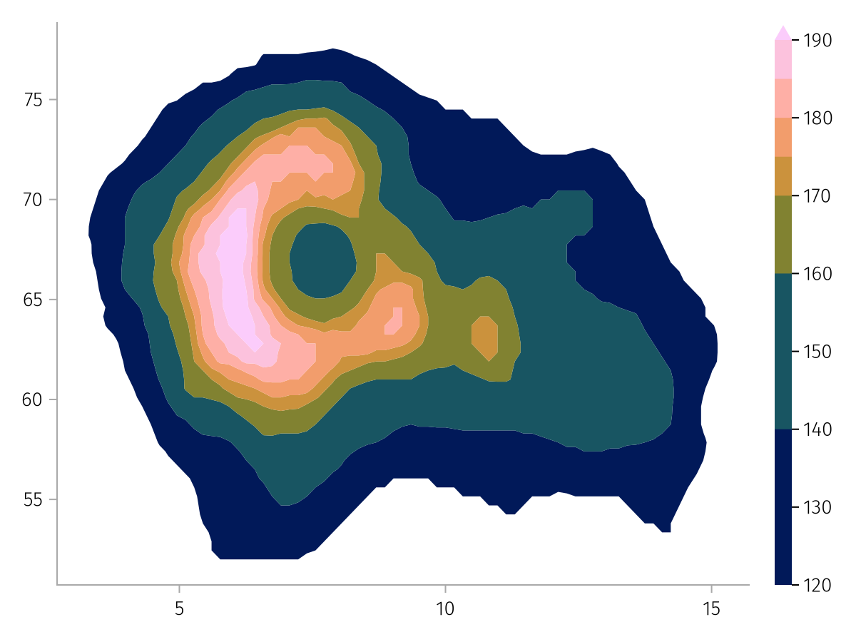
The colorbar can be disabled to receive a legend instead:
draw(contour_spec, scales(Color = (; colorbar = false)))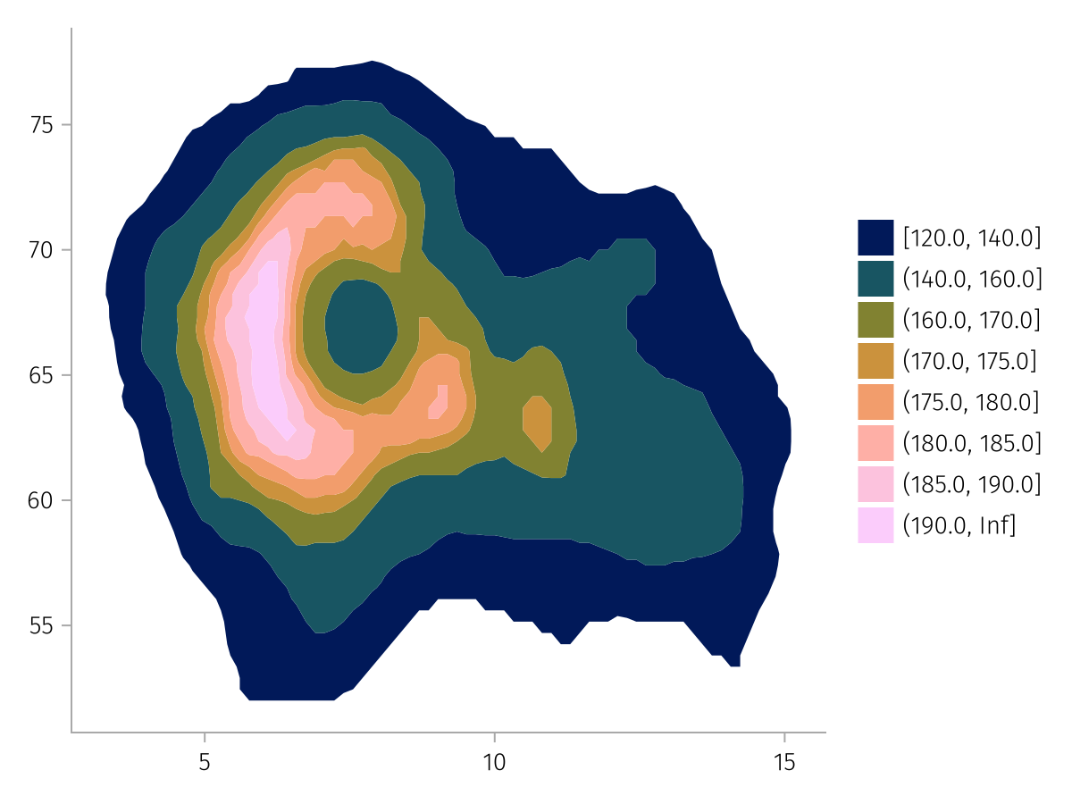
Similarly, a normal categorical color scale is represented with a legend:
using AlgebraOfGraphics
using CairoMakie

cat_color = data(AlgebraOfGraphics.penguins()) *
    mapping(:flipper_length_mm, :bill_depth_mm, color = (:species, :island) => (x, y) -> "$x on $y") *
    visual(Scatter)

draw(cat_color)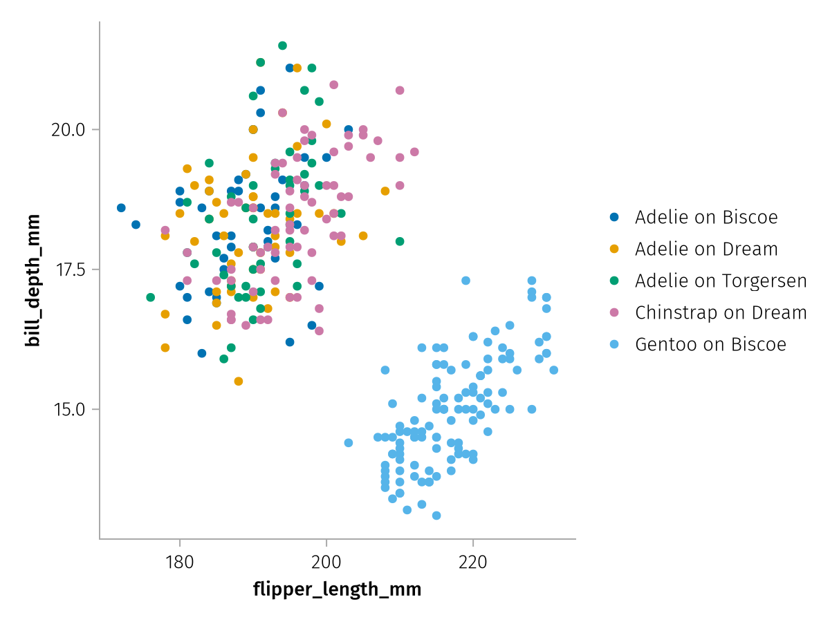
But can be switched to a colorbar representation by setting colorbar = true:
draw(cat_color, scales(Color = (; colorbar = true)))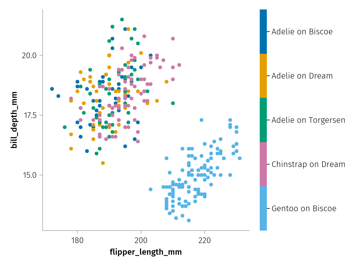
Shared continuous scale options
Unit
AlgebraOfGraphics supports input data with units, currently Unitful.jl and DynamicQuantities.jl have extensions implemented.
If a continuous scale detects units, the units will be attached to the respective scale label. The display unit can be overridden using the unit scale keyword, which will appropriately rescale the data:
using AlgebraOfGraphics
using CairoMakie
using Unitful
using DataFrames

df = DataFrame(AlgebraOfGraphics.penguins())
df.bill_length = df.bill_length_mm .* u"mm"
df.bill_depth = uconvert.(u"cm", df.bill_depth_mm .* u"mm")

spec = data(df) * mapping(:bill_length, :bill_depth, color = :species) * visual(Scatter)

f = Figure()
draw!(f[1, 1], spec)
draw!(f[1, 2], spec, scales(X = (; unit = u"m"), Y = (; unit = u"mm")))
f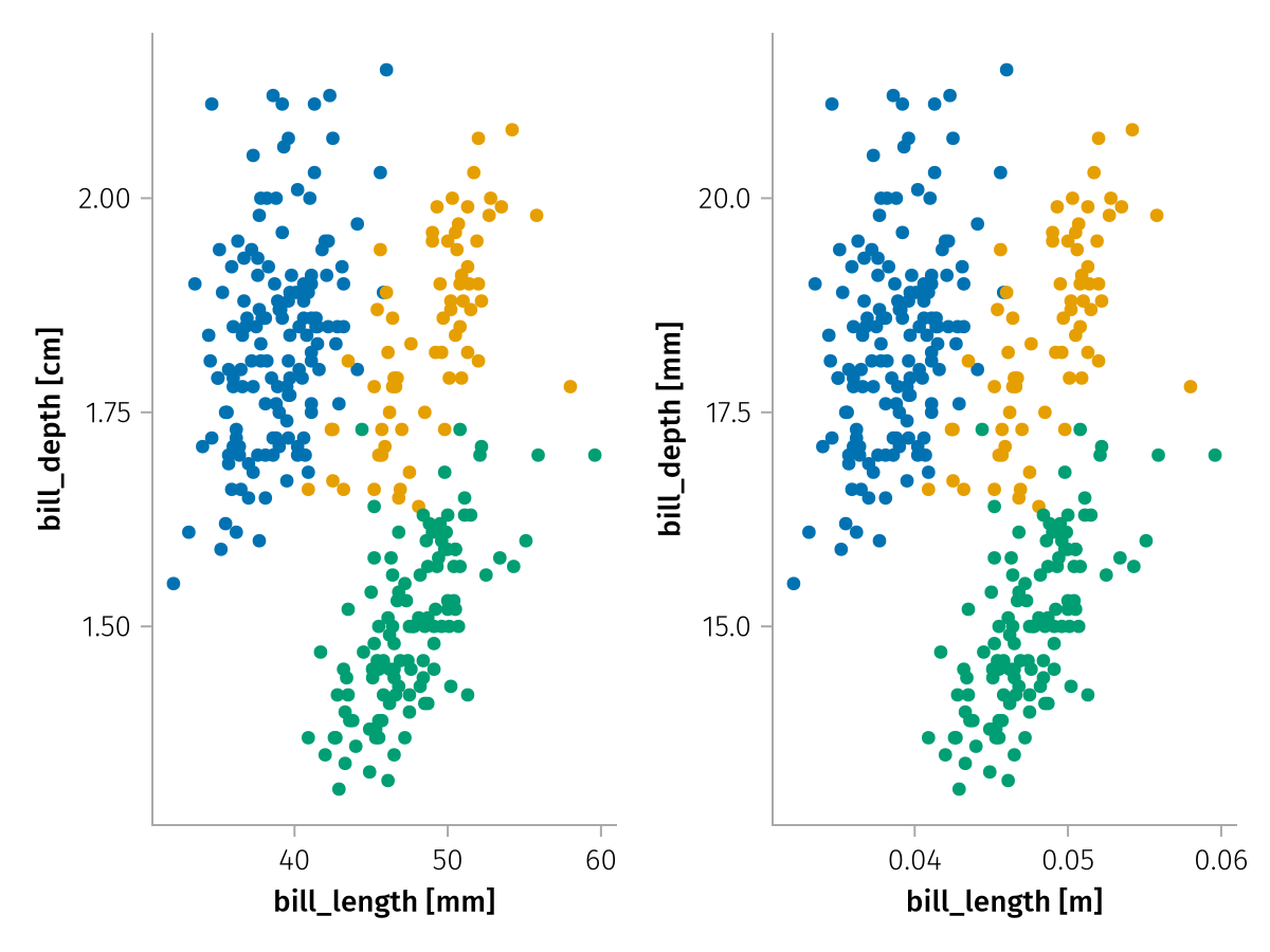
Special continuous scale options
Color
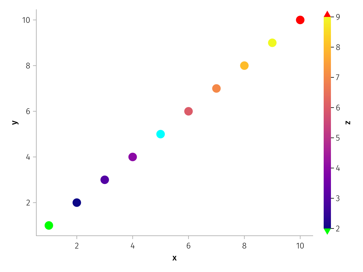
Continuous color scales can be modified using the familiar Makie attributes colormap, colorrange, highclip, lowclip and nan_color. By default, colorrange is set to the extrema of the encountered values, so no clipping occurs. A transform function can be set via the scale attribute.
using AlgebraOfGraphics
using CairoMakie

spec = data((; x = 1:10, y = 1:10, z = [1:4; NaN; 6:10])) *
    mapping(:x, :y, color = :z) *
    visual(Scatter, markersize = 20)

draw(spec, scales(
    Color = (;
        colormap = :plasma,
        nan_color = :cyan,
        lowclip = :lime,
        highclip = :red,
        colorrange = (2, 9)
    )
))
This example shows a log-transformed color scale:
using AlgebraOfGraphics
using CairoMakie

spec = data((; x = 1:10, y = 1:10, z = exp10.(range(1, 4, length = 10)))) *
    mapping(:x, :y, color = :z) *
    visual(Scatter, markersize = 20)

draw(spec, scales(Color = (; scale = log10)))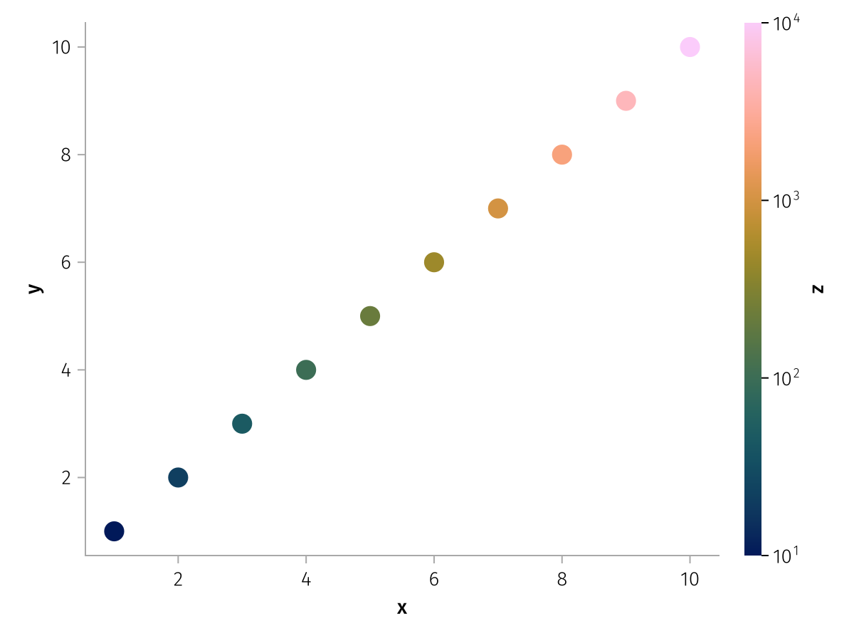
MarkerSize
The range of marker sizes can be set with the sizerange attribute. Marker sizes are computed such that their area, and not markersize itself, grows linearly with the scale values.
using AlgebraOfGraphics
using CairoMakie

spec = data((; x = 1:10, y = 1:10, z = 10:10:100)) *
    mapping(:x, :y, markersize = :z) *
    visual(Scatter)

f = Figure()

grid = draw!(f[1, 1], spec, scales(
    MarkerSize = (;
        sizerange = (5, 15)
    )
))
legend!(f[1, 2], grid)

grid2 = draw!(f[2, 1], spec, scales(
    MarkerSize = (;
        sizerange = (5, 30)
    )
))
legend!(f[2, 2], grid2)

f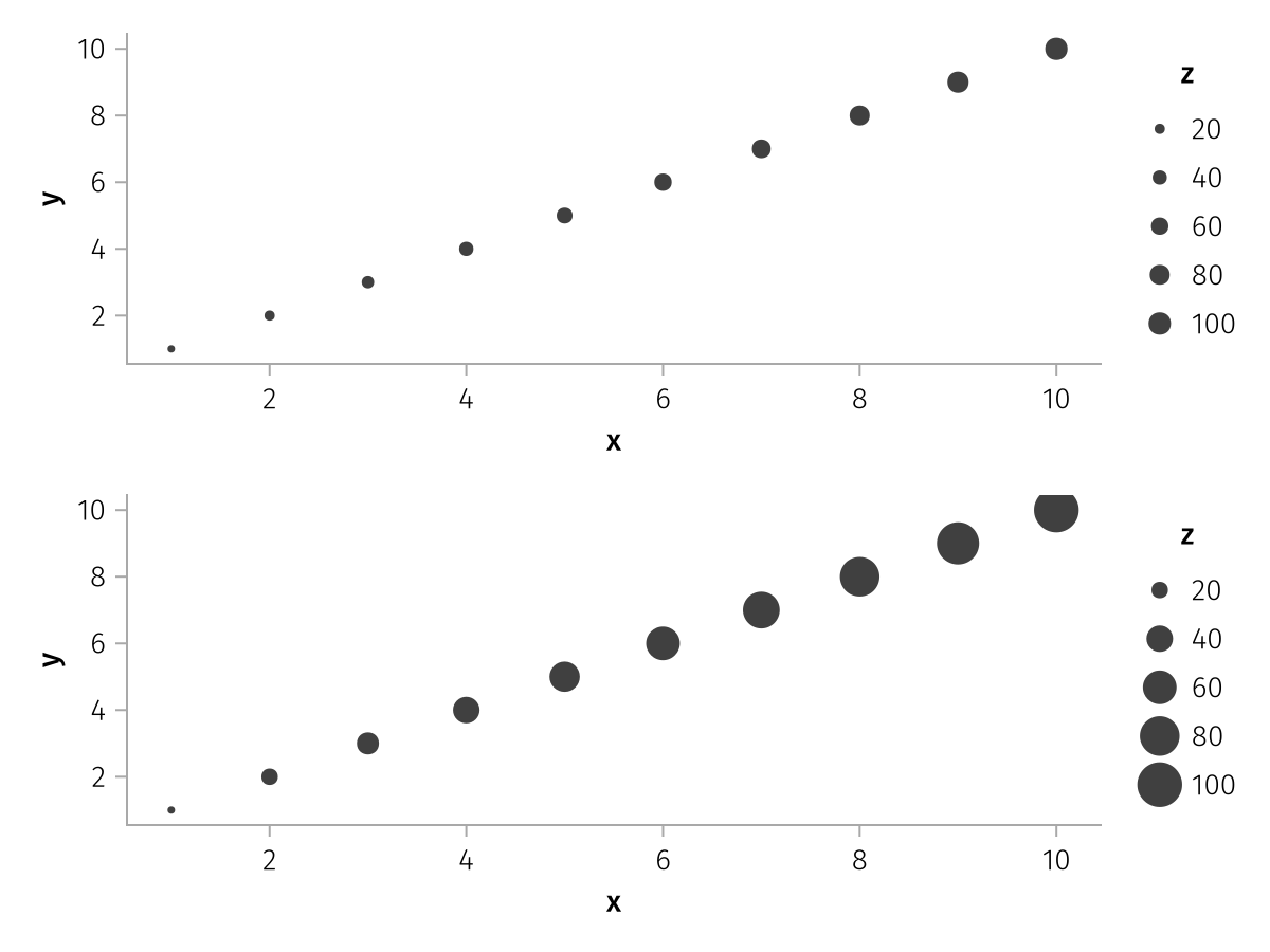
The values which are chosen for the legend can be controlled with the ticks and tickformat scale properties. Ticks and ticklabels are computed using Makie's Axis infrastructure and therefore work with all objects that Makie supports for Axis attributes xticks/yticks and xtickformat/ytickformat.
using AlgebraOfGraphics
using CairoMakie

spec = data((; x = 1:10, y = 1:10, z = 10:10:100)) *
    mapping(:x, :y, markersize = :z) *
    visual(Scatter)

draw(spec, scales(MarkerSize = (; ticks = [10, 50, 100])))
using AlgebraOfGraphics
using CairoMakie

spec = data((; x = 1:10, y = 1:10, z = 10:10:100)) *
    mapping(:x, :y, markersize = :z) *
    visual(Scatter)

draw(spec, scales(MarkerSize = (; tickformat = "{:.1f} mg")))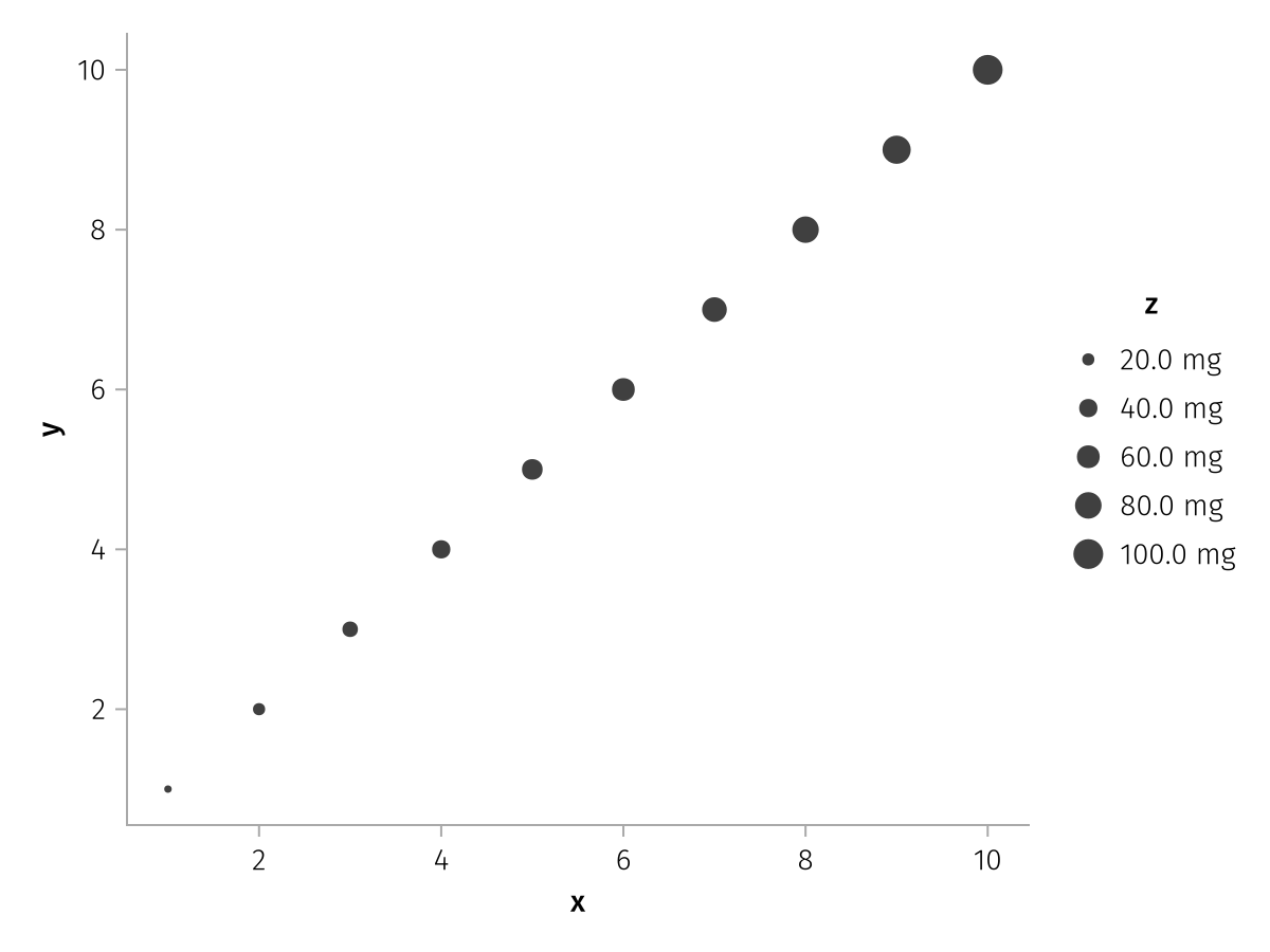
LineWidth
The range of line widths can be set with the sizerange attribute. Line widths are proportional to scale values. Note that in CairoMakie, line widths are not allowed to change continuously, so you either have to ensure that there are NaN gaps, or use the group mapping to split the line up by the same variable, just nonnumeric.
using AlgebraOfGraphics
using CairoMakie

x = repeat(range(0, 1.5, length = 30), 5)
y = x .^ repeat(range(0.5, 3, length = 5), inner = 30)
z = repeat([1, 2, 5, 10, 20], inner = 30)

spec = data((; x, y, z)) *
    mapping(:x, :y, linewidth = :z, group = :z => nonnumeric) *
    visual(Lines)

f = Figure()

grid = draw!(f[1, 1], spec)
legend!(f[1, 2], grid)

grid2 = draw!(f[2, 1], spec, scales(
    LineWidth = (;
        sizerange = (1, 8),
    )
))
legend!(f[2, 2], grid2)

f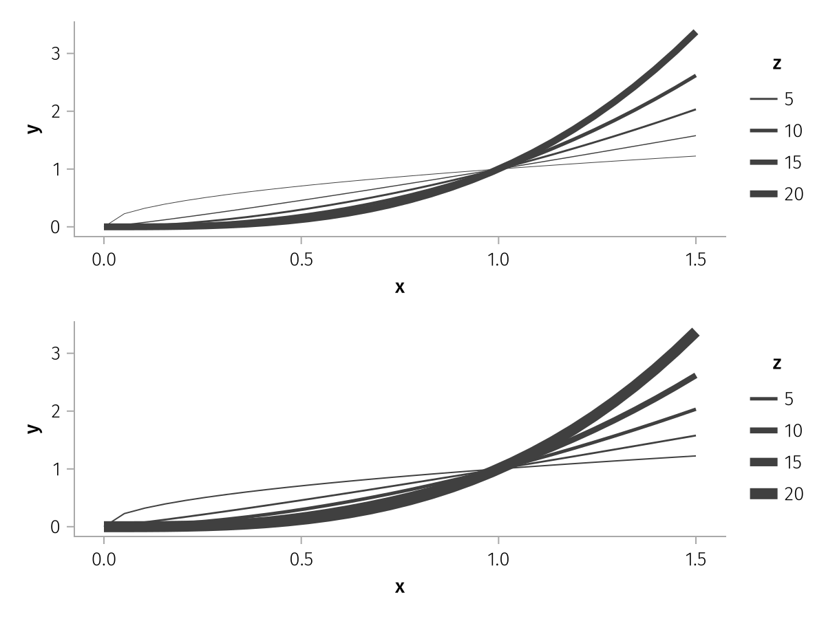
The values which are chosen for the legend can be controlled with the ticks and tickformat scale properties. Ticks and ticklabels are computed using Makie's Axis infrastructure and therefore work with all objects that Makie supports for Axis attributes xticks/yticks and xtickformat/ytickformat.
using AlgebraOfGraphics
using CairoMakie

x = repeat(range(0, 1.5, length = 30), 5)
y = x .^ repeat(range(0.5, 3, length = 5), inner = 30)
z = repeat([1, 2, 5, 10, 20], inner = 30)

spec = data((; x, y, z)) *
    mapping(:x, :y, linewidth = :z, group = :z => nonnumeric) *
    visual(Lines)

draw(spec, scales(LineWidth = (; ticks = [1, 2, 5, 10, 20])))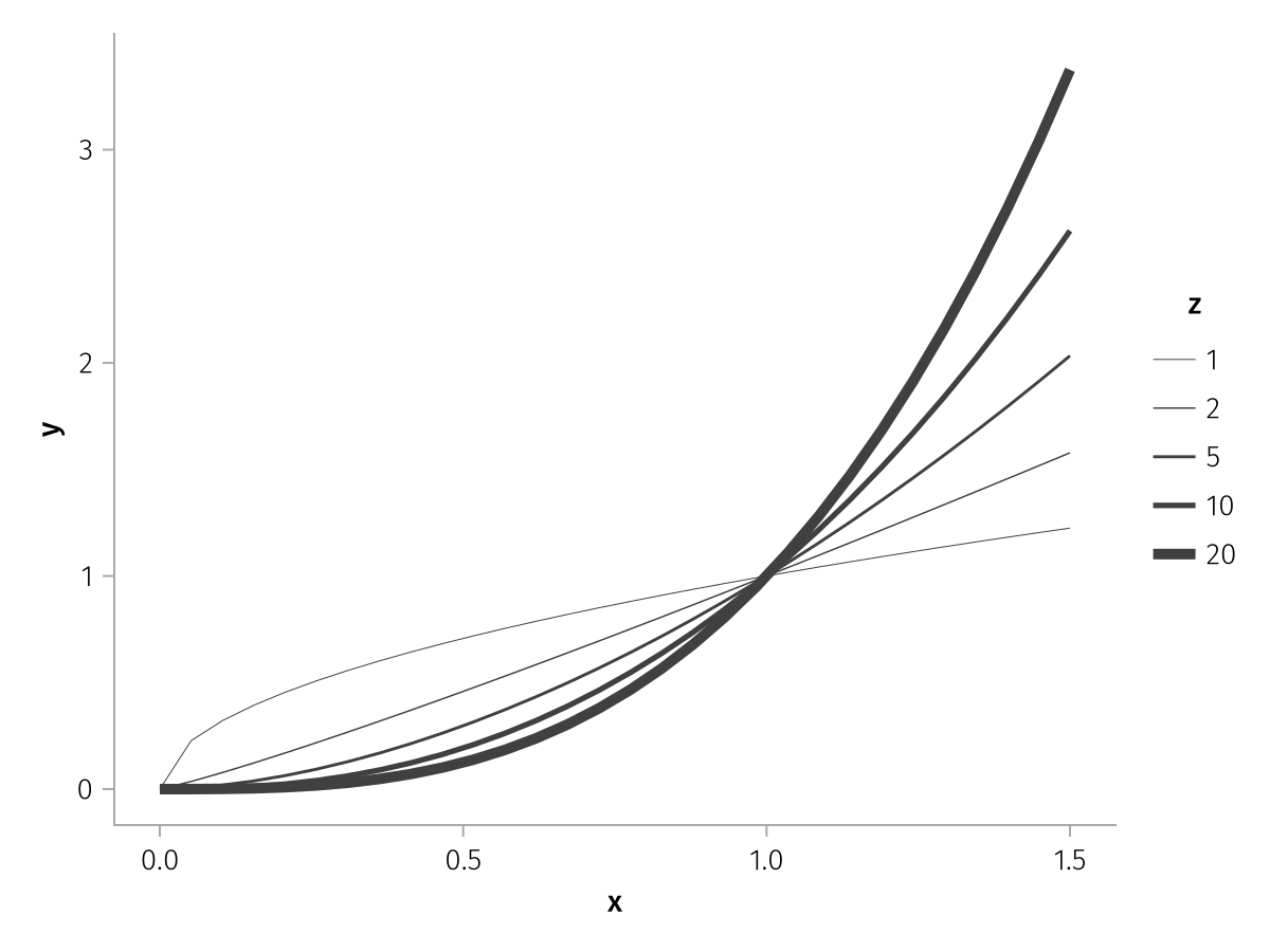
using AlgebraOfGraphics
using CairoMakie

x = repeat(range(0, 1.5, length = 30), 5)
y = x .^ repeat(range(0.5, 3, length = 5), inner = 30)
z = repeat([1, 2, 5, 10, 20], inner = 30)

spec = data((; x, y, z)) *
    mapping(:x, :y, linewidth = :z, group = :z => nonnumeric) *
    visual(Lines)

draw(spec, scales(LineWidth = (; tickformat = "{:.1f} mg")))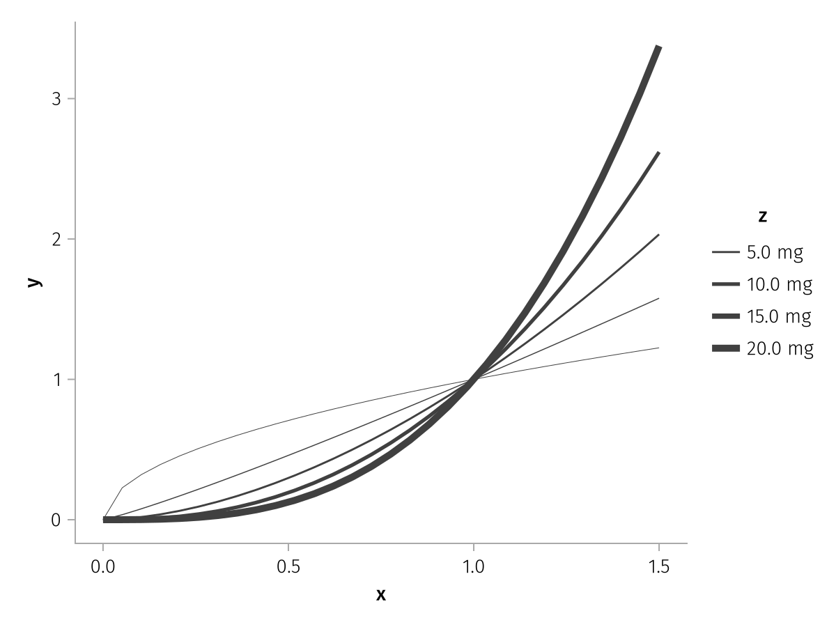
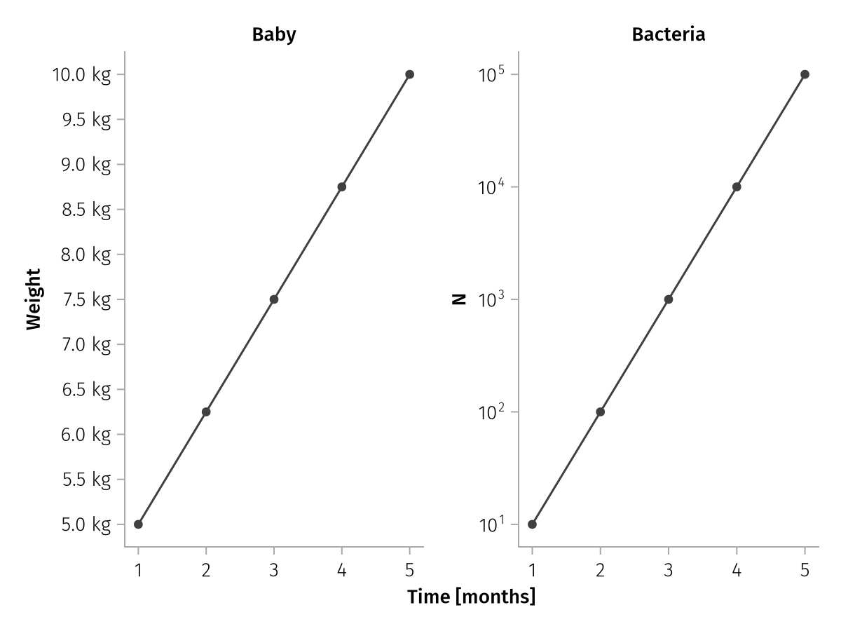
X, Y & Z
You can set the axis properties ticks, tickformat and scale. While these can also be set globally via the axis options, setting them via scale options is more explicit and allows to use them in scenarios with multiple scales in facet layouts.
using AlgebraOfGraphics
using CairoMakie

x = 1:5
y1 = range(5, 10; length = 5)
y2 = logrange(10, 100_000; length = 5)

spec = (
    mapping(x => "Time [months]", y1 => "Weight"; layout = "Baby") +
    mapping(x => "Time [months]", y2 => "N" => scale(:Y2); layout = "Bacteria")
) * visual(ScatterLines)

draw(
    spec,
    scales(
        Y = (; tickformat = "{:.1f} kg", ticks = 5:0.5:10),
        Y2 = (; scale = log10)
    ),
)
Unlike ticks and tickformat, the scale function also affects analyses. When a scale is set on an aesthetic, analyses like linear, smooth, density and histogram fit in the transformed space and back-transform their output, so the fit matches the scaled display. This differs from setting axis = (; yscale = log10), which is a display-only Makie axis attribute applied after the analysis has already run in data space. In the left panel below the line is fit in linear space and curves away from the log-linear data, in the right panel it is fit in log space and tracks it:
using AlgebraOfGraphics
using CairoMakie

t = repeat(0.0:1:8, inner = 2)
conc = @. 100 * 10^(-0.09 * t)
base = data((; t, conc)) * mapping(:t => "time (h)", :conc => "concentration (mg/L)")
spec = base * visual(Scatter) + base * linear(interval = nothing) * visual(color = :firebrick)

fig = Figure(size = (800, 350))
draw!(fig[1, 1], spec; axis = (; yscale = log10, title = "axis = (; yscale = log10)"))
draw!(fig[1, 2], spec, scales(Y = (; scale = log10)); axis = (; title = "scales(Y = (; scale = log10))"))
fig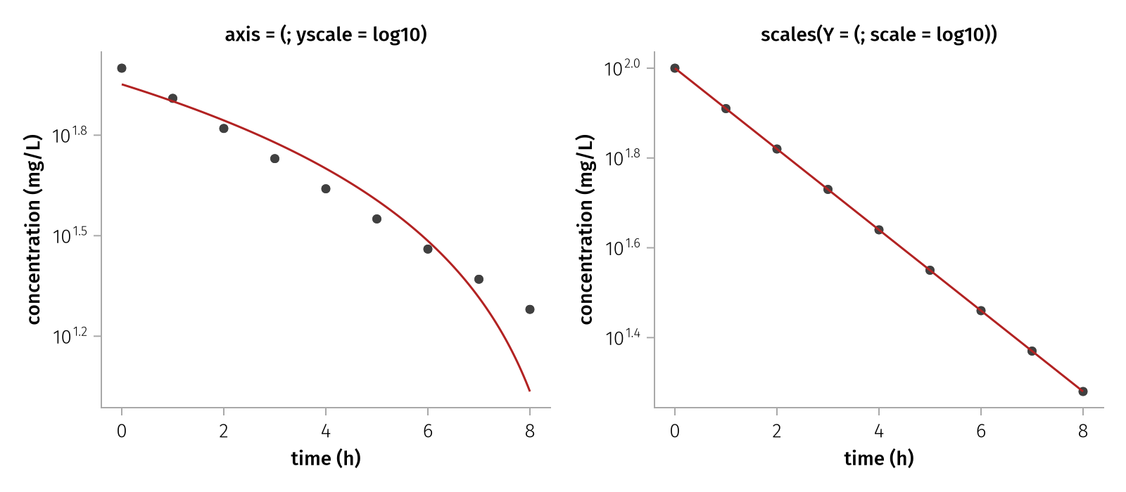
The scale function must have an inverse registered with Makie.inverse_transform (e.g. log10, log2, log, sqrt) so analyses can back-transform their fit.
Only statistics computed by AlgebraOfGraphics analyses participate in this. A statistic computed inside a Makie recipe (e.g. visual(Density) or visual(Hist), which run their own kernel density estimate or binning on the data AlgebraOfGraphics hands them) does not see the scale and is computed in data space, only its display is transformed. To compute in the scaled space, use the AlgebraOfGraphics analysis (AlgebraOfGraphics.density(), histogram(), ...) instead of the recipe.
Legend options
The legend keyword forwards most attributes to Makie's Legend function. The exceptions are listed here.
show
Setting show = false hides the legend completely. This applies to draw and not draw! as the latter doesn't draw the legend automatically.
using AlgebraOfGraphics
using CairoMakie

spec = data((x = 1:3, y = 1:3, group = ["A", "B", "C"])) * mapping(:x, :y, color = :group) * visual(Scatter)

draw(spec; legend = (; show = false))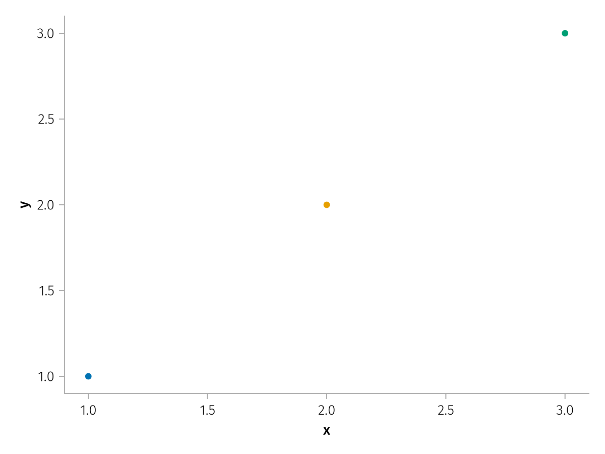
order
By default, the legend order depends on the order in which layers and mappings have been defined, as well as whether scales are categorical or continuous.
using AlgebraOfGraphics
using CairoMakie

df = (;
    x = 1:12,
    y = 1:12,
    z = 1:12,
    group1 = repeat(["A", "B", "C"], inner = 4),
    group2 = repeat(["X", "Y"], 6),
)

spec = data(df) *
    mapping(:x, :y, markersize = :z, color = :group1, marker = :group2) *
    visual(Scatter)

draw(spec)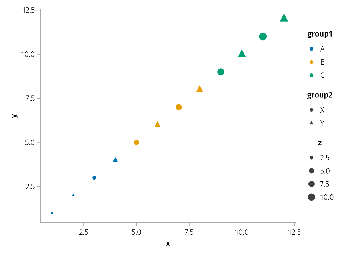
You can reorder the legend with the order keyword. This expects a vector with either Symbols or Vector{Symbol}s as elements, where each Symbol is the identifier for a scale that's represented in the legend.
Plain Symbols can be used for simple reordering:
draw(spec; legend = (; order = [:MarkerSize, :Color, :Marker]))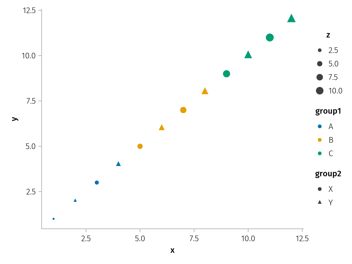
Symbols that are grouped into Vectors indicate that their groups should be merged together. For example, consider this plot that features two color scales, but one for a scatter plot and one for a line plot.
using AlgebraOfGraphics
using CairoMakie

df_a = (; x = 1:9, y = [1, 2, 3, 5, 6, 7, 9, 10, 11], group = repeat(["A", "B", "C"], inner = 3))

spec1 = data(df_a) * mapping(:x, :y, strokecolor = :group) * visual(Scatter, color = :transparent, strokewidth = 3, markersize = 15)

df_b = (; y = [4, 8], threshold = ["first", "second"])

spec2_custom_scale = data(df_b) * mapping(:y, color = :threshold => scale(:color2)) * visual(HLines)

draw(spec1 + spec2_custom_scale)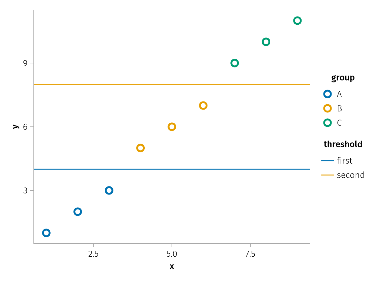
You can group the two scales together using order. The titles are dropped.
draw(spec1 + spec2_custom_scale; legend = (; order = [[:Color, :color2]]))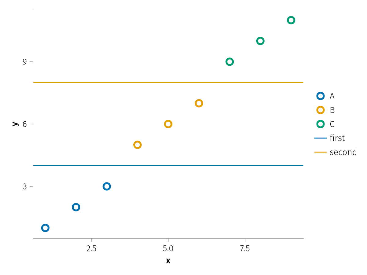
If you want to add a title to a merged group, you can add it with the group => title pair syntax:
draw(spec1 + spec2_custom_scale; legend = (; order = [[:Color, :color2] => "Title"]))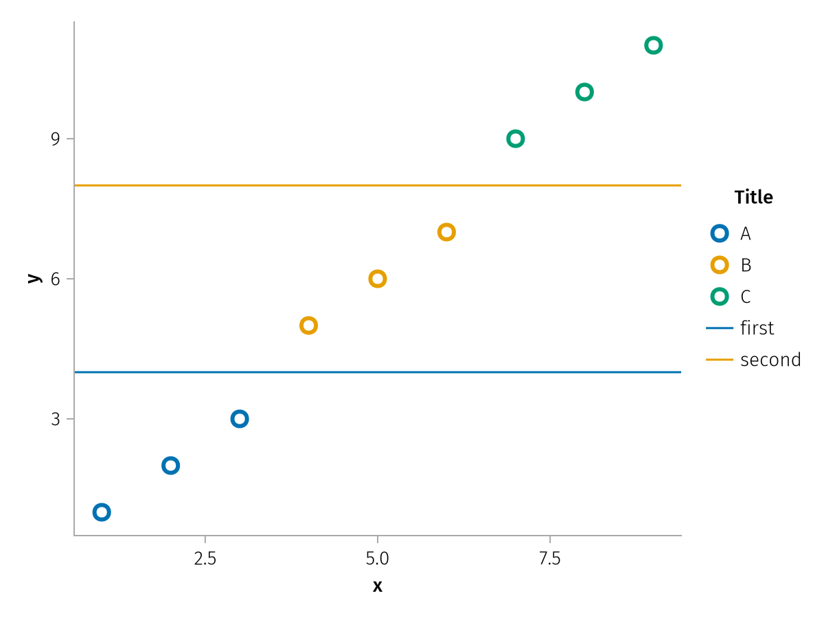
hide_unused
By default, when multiple plot types share a categorical scale but each covers only a subset of the categories, only the plot types that actually have data for a category contribute their element to the legend entry.
Setting hide_unused = false disables this, causing every plot type to contribute its element to every legend entry regardless of whether data exists.
using AlgebraOfGraphics
using CairoMakie

df_scatter = (; x = [1, 2, 1, 2], y = [1, 2, 3, 4], g = ["a", "a", "b", "b"])
df_lines = (; x = [1, 2, 1, 2], y = [2, 1, 4, 3], g = ["b", "b", "c", "c"])
spec = data(df_scatter) * mapping(:x, :y, color = :g) * visual(Scatter) +
    data(df_lines) * mapping(:x, :y, color = :g) * visual(Lines)

f = Figure()
draw!(f[1, 1], spec) |> fg -> legend!(f[1, 2], fg)
Label(f[1, 1, Top()], "default (hide_unused = true)"; padding = (0, 0, 5, 0))
draw!(f[2, 1], spec) |> fg -> legend!(f[2, 2], fg; hide_unused = false)
Label(f[2, 1, Top()], "hide_unused = false"; padding = (0, 0, 5, 0))
f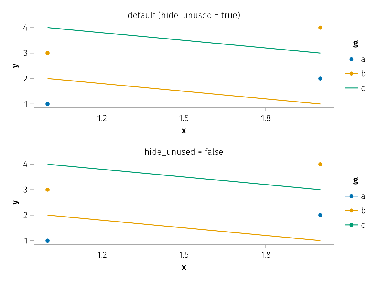
Figure options
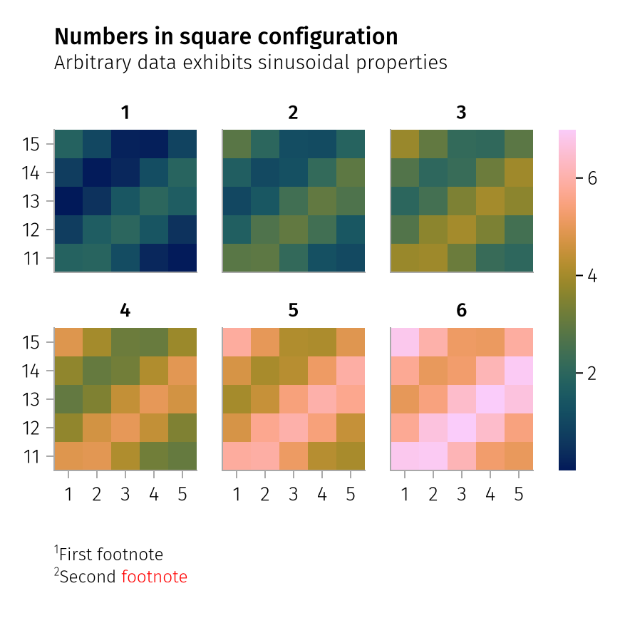
AlgebraOfGraphics can add a title, subtitle and footnotes to a figure automatically. Settings for these must be passed to the figure keyword. Check the draw function for a complete list.
using AlgebraOfGraphics
using CairoMakie

spec = pregrouped(
    fill(repeat(1:5, 5), 6),
    fill(repeat(11:15, inner = 5), 6),
    [sin.(1:25) .+ i for i in 1:6],
    layout = 1:6 => nonnumeric) * visual(Heatmap)

draw(
    spec;
    figure = (;
        title = "Numbers in square configuration",
        subtitle = "Arbitrary data exhibits sinusoidal properties",
        footnotes = [
            rich(superscript("1"), "First footnote"),
            rich(superscript("2"), "Second ", rich("footnote", color = :red)),
        ],
    ),
    axis = (; width = 100, height = 100)
)