Intro to AoG - V - Alternative input data formats
So far, every example you've seen in this tutorial series was using a long-format or "tidy" dataframe in the tradition of ggplot2.
Sometimes, however, our data does not come in this format, and we don't want to spend the time to transform it before we start plotting. In this case, it's good to be aware of alternative methods of specifying and handling input data that AlgebraOfGraphics offers.
Specify data directly in mapping
The first alternative is still about long-format data, but it omits the tables. Let's say we just happen to have three vectors of data lying around. We simulate that here by extracting them from the familiar penguins dataframe:
using AlgebraOfGraphics
using CairoMakie
using DataFrames

penguins = DataFrame(AlgebraOfGraphics.penguins())

bill_lengths = penguins.bill_length_mm
bill_depths = penguins.bill_depth_mm
species = penguins.species
Of course we could form a table from them first and pass them with data, but there's a shorter way. We omit data and just pass the columns directly to mapping:
no_data = mapping(bill_lengths, bill_depths, color = species) * visual(Scatter)

draw(no_data)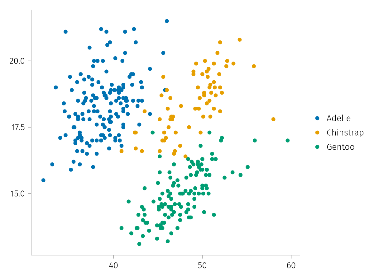
Note that we lose the labels that the column names usually provide. We can provide them as usual in the scales or by pairing them:
no_data_labeled = mapping(
    bill_lengths => "Bill length (mm)",
    bill_depths => "Bill depth (mm)",
    color = species => "Species",
) * visual(Scatter)

draw(no_data_labeled)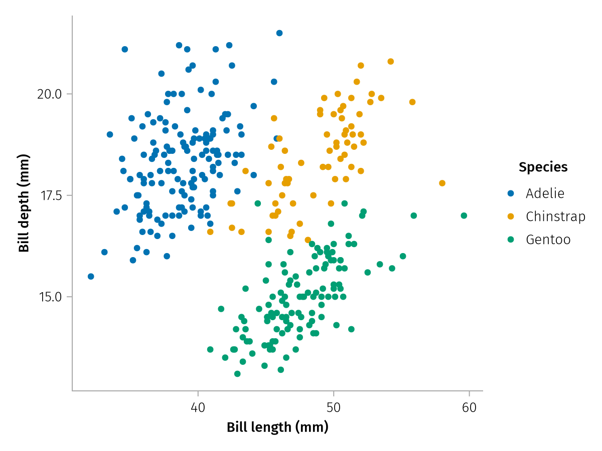
Add columns using direct
Another special case with long-format data is when we do have a table, but we also have some outside information as a vector or scalar. In this case it's annoying having to construct a new table just to pass our additional data in. To directly pass in columns, you can use the direct helper function in conjunction with data.
Let's pretend we have computed a "cuteness score" for our penguins using some classifier, which we now have in a vector. We can create a plot where we mix that data with the penguins dataframe without having to construct a new table:
using Statistics

cuteness = randn(size(penguins, 1))

cuteness_spec = data(penguins) * mapping(:flipper_length_mm, direct(cuteness) => "cuteness", color = :species)

draw(cuteness_spec)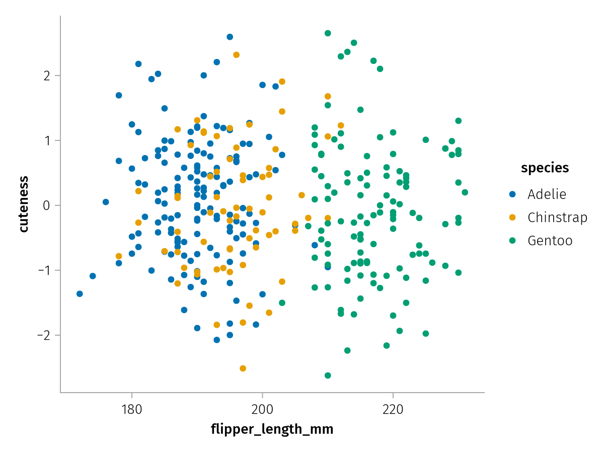
We can also specify scalars in direct which sometimes comes in handy when we define groups on the fly. For example, if we had two dataframes which we didn't want to merge into long format, but just plot in a facet each, we could add two layers that specify a layout value using direct, without having to construct a column with the correct length for each:
first_half = penguins[1:end÷2,:]
second_half = penguins[end÷2+1:end,:]

two_halves_base = (data(first_half) * mapping(layout = direct("First Half")) + data(second_half) * mapping(layout = direct("Second Half")))
two_halves = two_halves_base * mapping(:bill_length_mm, :bill_depth_mm) * visual(Scatter)

draw(two_halves)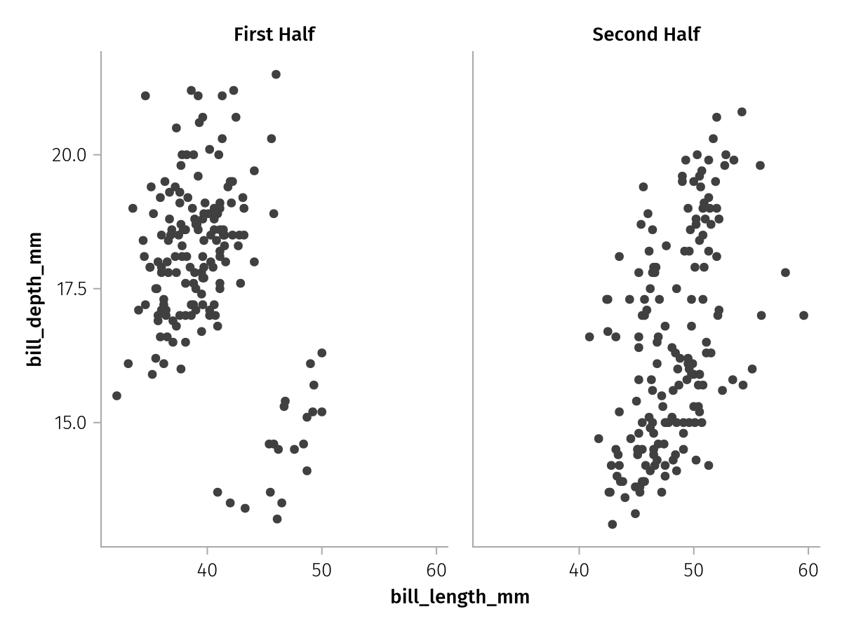
Wide data
One special power of AlgebraOfGraphics is its ability to handle wide format data. While every wide dataframe can be converted back and forth from a long one using stack and unstack, doing so certainly adds a bit of mental overhead which we generally like to avoid in exploratory plotting.
For example, let's say we had four different weight measurements, one for each season. We pretend that penguins start thinner in spring, grow in summer and autumn and then lose weight again going into winter.
season_penguins = transform(
    penguins,
    :body_mass_g .=>
        [col -> col .* x for x in [0.8, 0.9, 1.1, 0.95]] .=>
        string.("body_mass_", ["spring", "summer", "autumn", "winter"])
    )

first(season_penguins[:, end-3:end], 5)| Row | body_mass_spring | body_mass_summer | body_mass_autumn | body_mass_winter |
|---|---|---|---|---|
| Float64 | Float64 | Float64 | Float64 | |
| 1 | 3000.0 | 3375.0 | 4125.0 | 3562.5 |
| 2 | 3040.0 | 3420.0 | 4180.0 | 3610.0 |
| 3 | 2600.0 | 2925.0 | 3575.0 | 3087.5 |
| 4 | 2760.0 | 3105.0 | 3795.0 | 3277.5 |
| 5 | 2920.0 | 3285.0 | 4015.0 | 3467.5 |
To get a long format dataframe, we could then apply the stack function:
stacked_penguins = stack(season_penguins, [:body_mass_spring, :body_mass_summer, :body_mass_autumn, :body_mass_winter])

first(stacked_penguins, 5)| Row | species | island | bill_length_mm | bill_depth_mm | flipper_length_mm | body_mass_g | sex | variable | value |
|---|---|---|---|---|---|---|---|---|---|
| String | String | Float64 | Float64 | Int64 | Int64 | String | String | Float64 | |
| 1 | Adelie | Torgersen | 39.1 | 18.7 | 181 | 3750 | male | body_mass_spring | 3000.0 |
| 2 | Adelie | Torgersen | 39.5 | 17.4 | 186 | 3800 | female | body_mass_spring | 3040.0 |
| 3 | Adelie | Torgersen | 40.3 | 18.0 | 195 | 3250 | female | body_mass_spring | 2600.0 |
| 4 | Adelie | Torgersen | 36.7 | 19.3 | 193 | 3450 | female | body_mass_spring | 2760.0 |
| 5 | Adelie | Torgersen | 39.3 | 20.6 | 190 | 3650 | male | body_mass_spring | 2920.0 |
This long dataframe we could then plot with our usual workflow. Note that after a stacking operation it's a little bit less descriptive what we're plotting because our columns are now called variable and value:
stacked_spec = data(stacked_penguins) *
    mapping(:sex, :value, col = :variable) *
    visual(Violin)

draw(stacked_spec)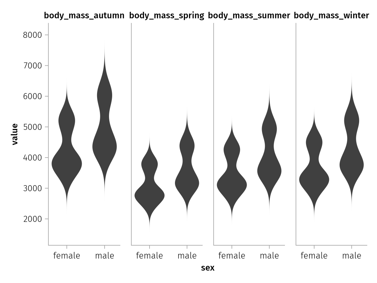
The order of the seasons is also alphabetical, but let's ignore that for now.
Now let's see how we could do the same plot with the original dataframe. We can specify an array of column selectors in mapping where so far we've only ever passed single column specifiers:
wide_spec = data(season_penguins) *
    mapping(
        :sex,
        [:body_mass_spring, :body_mass_summer, :body_mass_autumn, :body_mass_winter],
        col = dims(1)
    ) *
    visual(Violin)

draw(wide_spec)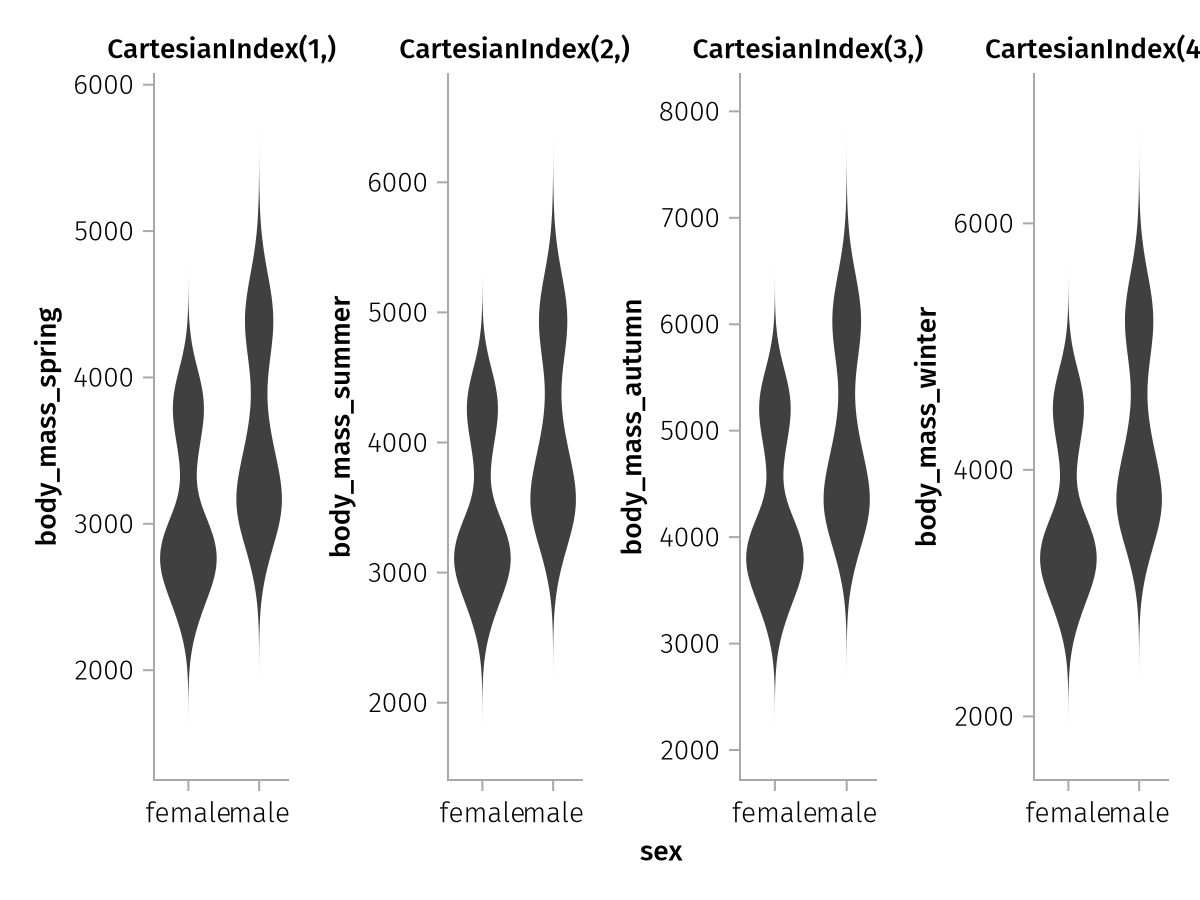
Now, something interesting happened.
The order of seasons is correct in this version, however each y axis has its own label now (corresponding to the source columns) and all y axes are unlinked. That is because AlgebraOfGraphics has the ability to extract labels across multiple input dimensions and it will not merge axes that are labeled differently. The input shape in our case is (4,) which is equivalent to the size of our four-column vectors. So there are four labels.
The expression col = dims(1) means that we want to split the dataset into col facets using the indices of the first dimension of our input shape (4,). That results in the CartesianIndex(1,) to CartesianIndex(4,) titles of the column facets.
We can assign a separate label to each column by broadcasting (.=>) label pairs with the column vector. We could specify four different labels, but in this case, the y axis is always the same. So we just broadcast the same label to all of them:
wide_spec_labeled = data(season_penguins) *
    mapping(
        :sex,
        [:body_mass_spring, :body_mass_summer, :body_mass_autumn, :body_mass_winter] .=> "Body Mass (g)",
        col = dims(1)
    ) *
    visual(Violin)

draw(wide_spec_labeled)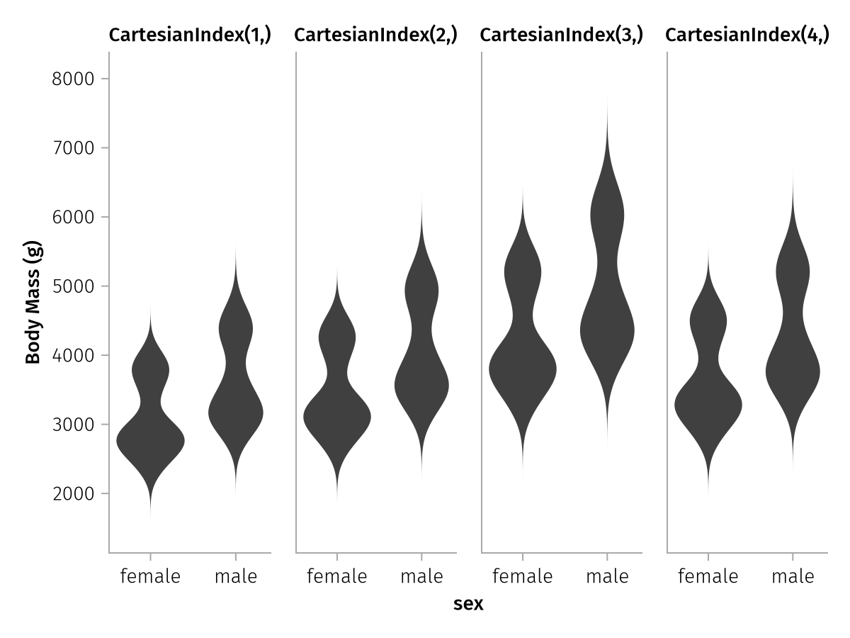
The four y axis labels are now all the same again, so the axis linking also goes into effect as usual and the three redundant labels are hidden. But the column labels are not nice, yet, because they just enumerate the indices of the first input dimension. The simplest way to rename these is to use the renamer utility that we have seen before.
wide_spec_final = data(season_penguins) *
    mapping(
        :sex,
        [:body_mass_spring, :body_mass_summer, :body_mass_autumn, :body_mass_winter] .=> "Body Mass (g)",
        col = dims(1) => renamer(["Spring", "Summer", "Autumn", "Winter"])
    ) *
    visual(Violin)

draw(wide_spec_final)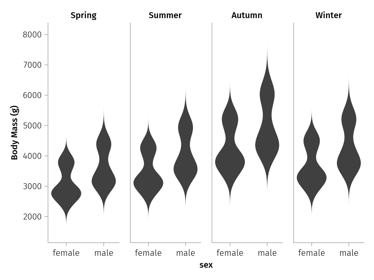
That looks much better!
More dimensions
To drive the point about multidimensional column selections home, here's another example where we have even more wide columns. In this example, there's not only four seasons, but also three different years, which gives 12 columns overall.
seasons = ["spring", "summer", "autumn", "winter"]
years = [2010, 2011, 2012]
matrix_of_columns = string.("body_mass_", seasons, "_", years')

years_penguins = transform(
    penguins,
    :body_mass_g .=>
        [col -> col .* x * y for x in [0.8, 0.9, 1.1, 0.95], y in [0.8, 1.2, 1.0]] .=>
        matrix_of_columns
    )

names(years_penguins)
19-element Vector{String}:
"species"
"island"
"bill_length_mm"
"bill_depth_mm"
"flipper_length_mm"
"body_mass_g"
"sex"
"body_mass_spring_2010"
"body_mass_summer_2010"
"body_mass_autumn_2010"
"body_mass_winter_2010"
"body_mass_spring_2011"
"body_mass_summer_2011"
"body_mass_autumn_2011"
"body_mass_winter_2011"
"body_mass_spring_2012"
"body_mass_summer_2012"
"body_mass_autumn_2012"
"body_mass_winter_2012"We now have a matrix of columns with shape (4, 3):
matrix_of_columns4×3 Matrix{String}:
"body_mass_spring_2010" "body_mass_spring_2011" "body_mass_spring_2012"
"body_mass_summer_2010" "body_mass_summer_2011" "body_mass_summer_2012"
"body_mass_autumn_2010" "body_mass_autumn_2011" "body_mass_autumn_2012"
"body_mass_winter_2010" "body_mass_winter_2011" "body_mass_winter_2012"When we then set col = dims(1) and row = dims(2), we get 4 columns for the seasons and 3 rows for the years.
spec = data(years_penguins) *
    mapping(
        :sex,
        matrix_of_columns .=> "Body Mass (g)",
        col = dims(1) => renamer(seasons),
        row = dims(2) => renamer(years),
    ) *
    visual(Violin)

draw(spec)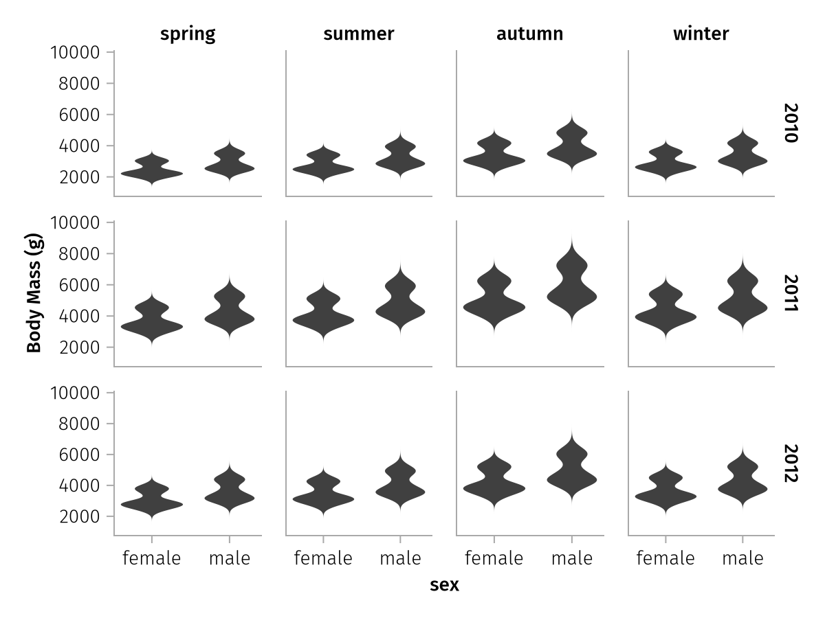
It is quite common for tabular datasets to encode some sort of multidimensional structure with similarly concatenated column names, so knowing about multidimensional wide data can come in handy.
In general, whether you use the stack-to-long or the wide workflow is mostly a matter of taste, you should always be able to go back and forth between the representations. But it's nice to have options, and especially for multidimensional cases, the necessary stack and split operations can be more complex.
Pregrouped data
Wide data is still tabular data, but AlgebraOfGraphics has another trick up its sleeve when it comes to input data formats. Sometimes, you may have data in an array-of-arrays format, where each inner array contains data for a group.
Let's start with a simple example. Here we have timestamps and measurements for some population. Each subject's data is already contained in its own array.
times = [
    [1, 2, 5, 7, 8],
    [3, 4, 7, 8],
    [2, 3, 6, 9],
]
measurements = [
    [0.2, 5.0, 3.0, 2.0, 1.2],
    [0.3, 4.7, 1.5, 1.1],
    [0.1, 5.9, 0.7, 0.3],
]
We can plot this data directly using the pregrouped function. This function is equivalent to doing data(AlgebraOfGraphics.Pregrouped()) * mapping(...), so it's essentially a special version of mapping:
pregrouped_spec = pregrouped(times, measurements) * visual(Lines)

draw(pregrouped_spec)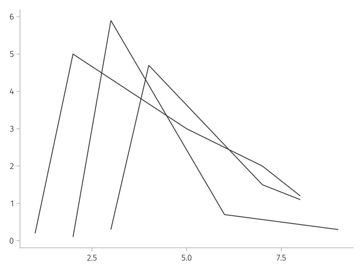
Because it's mapping under the hood, we can pair labels in pregrouped like usual:
pregrouped_labeled = pregrouped(times => "Time", measurements => "Measurement") * visual(Lines)

draw(pregrouped_labeled)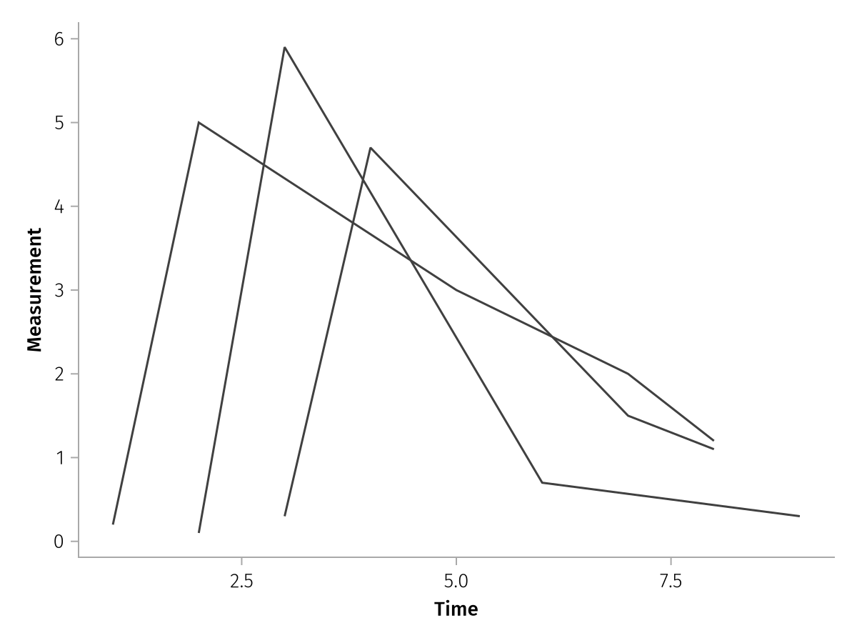
As you can see, each subject has a separate line, because the data are inherently grouped through the array structure. Compare to the same plot but with merged input arrays, which we can pass via mapping. Now there is a single line which zig-zags back and forth.
times_merged = reduce(vcat, times)
measurements_merged = reduce(vcat, measurements)

merged_spec = mapping(times_merged, measurements_merged) * visual(Lines)

draw(merged_spec)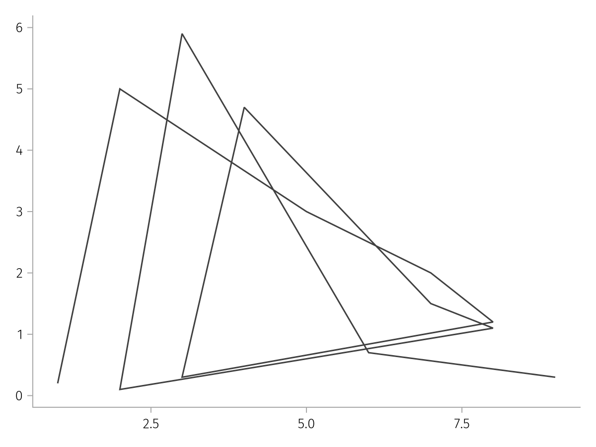
Because the pregrouped data already has a one-dimensional input shape (compare to the wide data above where we saw a one-dimensional and a two-dimensional input shape), we can even do a quick facet plot by using the dims helper:
pregrouped_faceted = pregrouped(
    times => "Time",
    measurements => "Measurement",
    layout = dims(1),
) * visual(Lines)

draw(pregrouped_faceted)![]()
Or the same thing with color, and renaming of the dims:
pregrouped_faceted = pregrouped(
    times => "Time",
    measurements => "Measurement",
    color = dims(1) => renamer(string.("Subject ", 1:3)),
) * visual(Lines)

draw(pregrouped_faceted)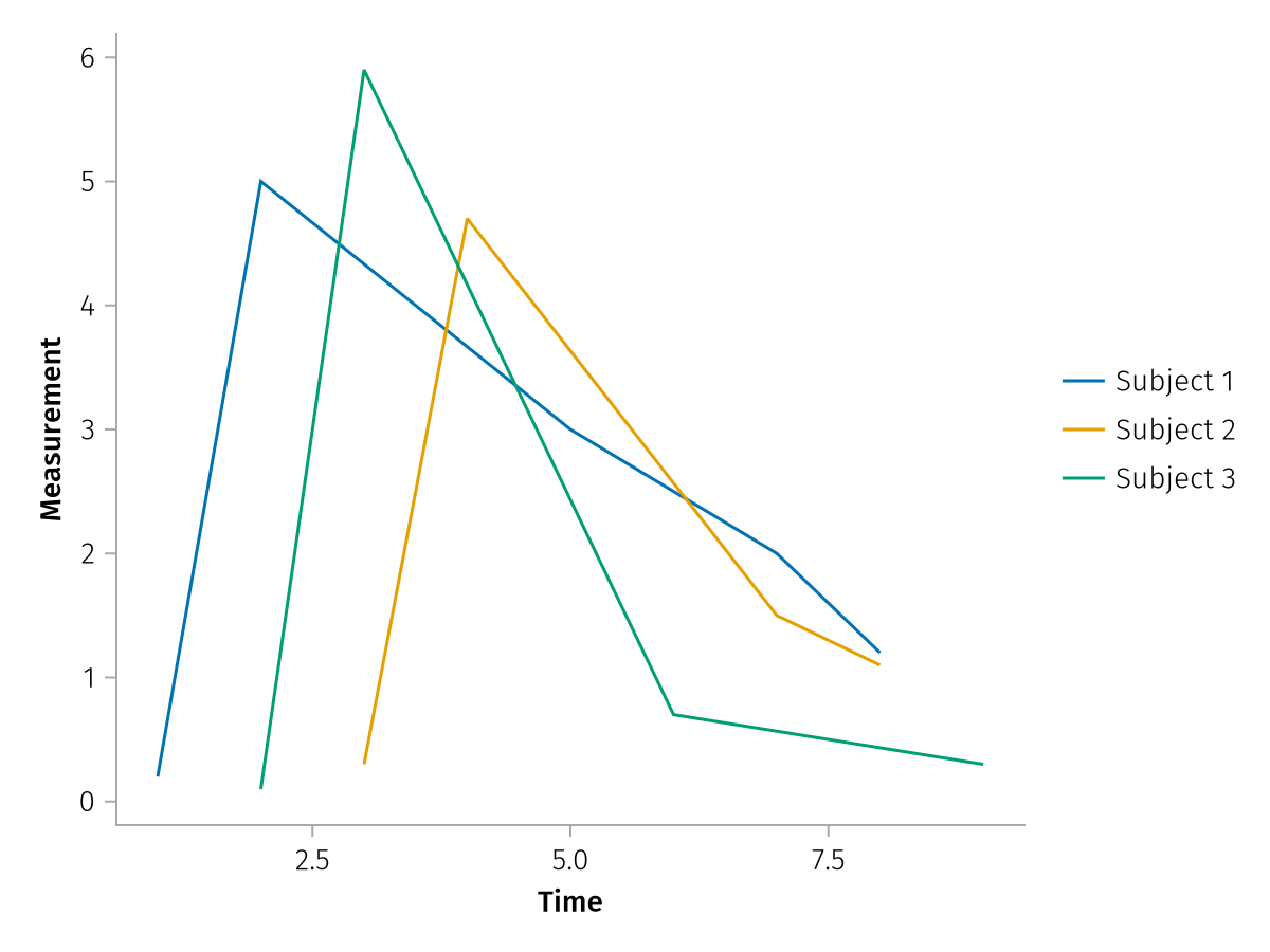
If we already have a vector of categorical values, we can also directly use that for one of the named arguments in pregrouped. For categorical values, due to the way that AlgebraOfGraphics structures grouped data, each group should have one entry, and not an array filled with the same value.
So instead of this...
subjects = [
    ["Subject 1", "Subject 1", "Subject 1", "Subject 1", "Subject 1"],
    ["Subject 2", "Subject 2", "Subject 2", "Subject 2"],
    ["Subject 3", "Subject 3", "Subject 3", "Subject 3"],
]
...we need a simple structure like this:
subjects = ["Subject 1", "Subject 2", "Subject 3"]

pregrouped_faceted_subjects = pregrouped(
    times => "Time",
    measurements => "Measurement",
    color = subjects,
) * visual(Lines)

draw(pregrouped_faceted_subjects)
The categorical values don't need to be unique within the vectors, you will still get one plot per entry due to the array structure:
same_subjects = ["Subject 1", "Subject 1", "Subject 1"]

pregrouped_faceted_same = pregrouped(
    times => "Time",
    measurements => "Measurement",
    color = same_subjects,
) * visual(Lines)

draw(pregrouped_faceted_same)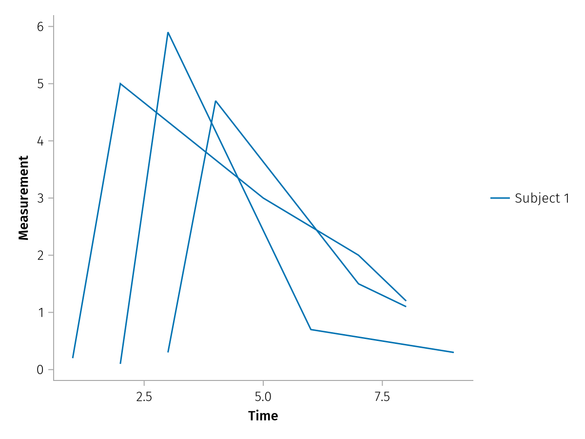
Even more dimensions
Here's one more example for pregrouped data that can demonstrate the possibility for multidimensional structure even more. In this scenario, imagine you are profiling some code in a loop, testing three different algorithms on four different branches of a repo and three different Julia versions. The data could come from code like this:
algorithms = ["Quick", "Merge", "Bubble"]
branches = ["master", "bugfix", "prerelease", "backport"]
julia_versions = ["1.10", "1.11", "nightly"]

timings = map(Iterators.product(algorithms, branches, enumerate(julia_versions))) do (algo, br, (i, jv))
    # here you would profile, we just generate random data with some structure
    20 .+ randn(100) .- 3 * i .+ randn()
end

size(timings)
(3, 4, 3)As you can see, we have an array of arrays with shape (3, 4, 3), so we can pass that directly via pregrouped and use dims to assign the three dimensions to different aesthetics:
multidim_pregrouped = pregrouped(
    timings => "Timings (s)",
    row = dims(1) => renamer(algorithms) => "Algorithm",
    col = dims(2) => renamer(branches),
    color = dims(3) => renamer(julia_versions) => "Julia version",
) * visual(Density)

draw(multidim_pregrouped)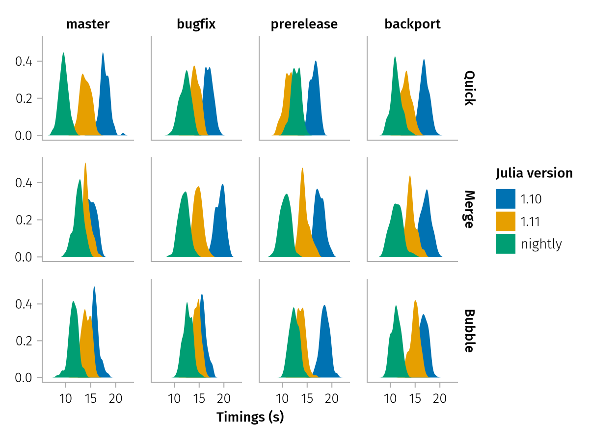
Isn't that impressively little code to get a quick visualization out of multidimensional non-tabular data?
Summary
In this chapter you have seen alternative ways of passing input data to AoG, circumventing data by passing columns to mapping directly, supplying additional columns using direct, as well as using multidimensional wide and pregrouped data.
In the next chapter, we're going to see how we can combine AoG plots with elements from Makie, and how we can modify the Makie objects that AoG creates.