Intro to AoG - II - Facet layouts and groups
In the previous chapter, we learned how to create basic visualizations like this one, using the data, mapping and visual functions to specify layers.
using AlgebraOfGraphics
using CairoMakie
using DataFrames

penguins = DataFrame(AlgebraOfGraphics.penguins())

spec = data(penguins) *
    mapping(:bill_length_mm, :bill_depth_mm, color = :species) *
    (AlgebraOfGraphics.density() * visual(Contour) + visual(Scatter))

draw(spec)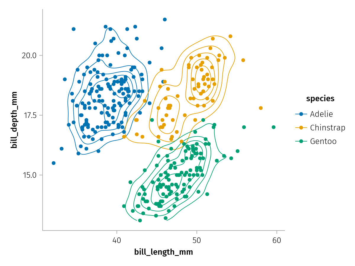
We also saw that each Makie plotting function which AoG supports has a number of possible attributes that can be used in mapping, for example:
AlgebraOfGraphics.aesthetic_mapping(Scatter, AlgebraOfGraphics.Continuous(), AlgebraOfGraphics.Continuous())6-element Dictionaries.Dictionary{Any, DataType}:
1 │ AlgebraOfGraphics.AesX
2 │ AlgebraOfGraphics.AesY
:color │ AlgebraOfGraphics.AesColor
:strokecolor │ AlgebraOfGraphics.AesColor
:marker │ AlgebraOfGraphics.AesMarker
:markersize │ AlgebraOfGraphics.AesMarkerSizeThere are, however, a few mappings that are not specific to each plotting function, but rather hardcoded into AlgebraOfGraphics and available for use with any plotting function. These are the three faceting mappings layout, row and col as well as the grouping mapping group and the dodging mappings dodge_x and dodge_y. We will look at the first four in this chapter.
Faceting
The facet mappings are used to break visualizations up into multiple axes or "facets", such that overplotting is reduced and each subgroup can be presented more clearly. There are two different ways to create a facet layout, either a wrapped layout using layout, or a grid layout using row and/or col.
Let's redo our example from above, this time we do not give each species a different color but a different facet:
facet_base = data(penguins) *
    mapping(:bill_length_mm, :bill_depth_mm) *
    (AlgebraOfGraphics.density() * visual(Contour) + visual(Scatter))

layout_faceted = facet_base * mapping(layout = :species)

draw(layout_faceted)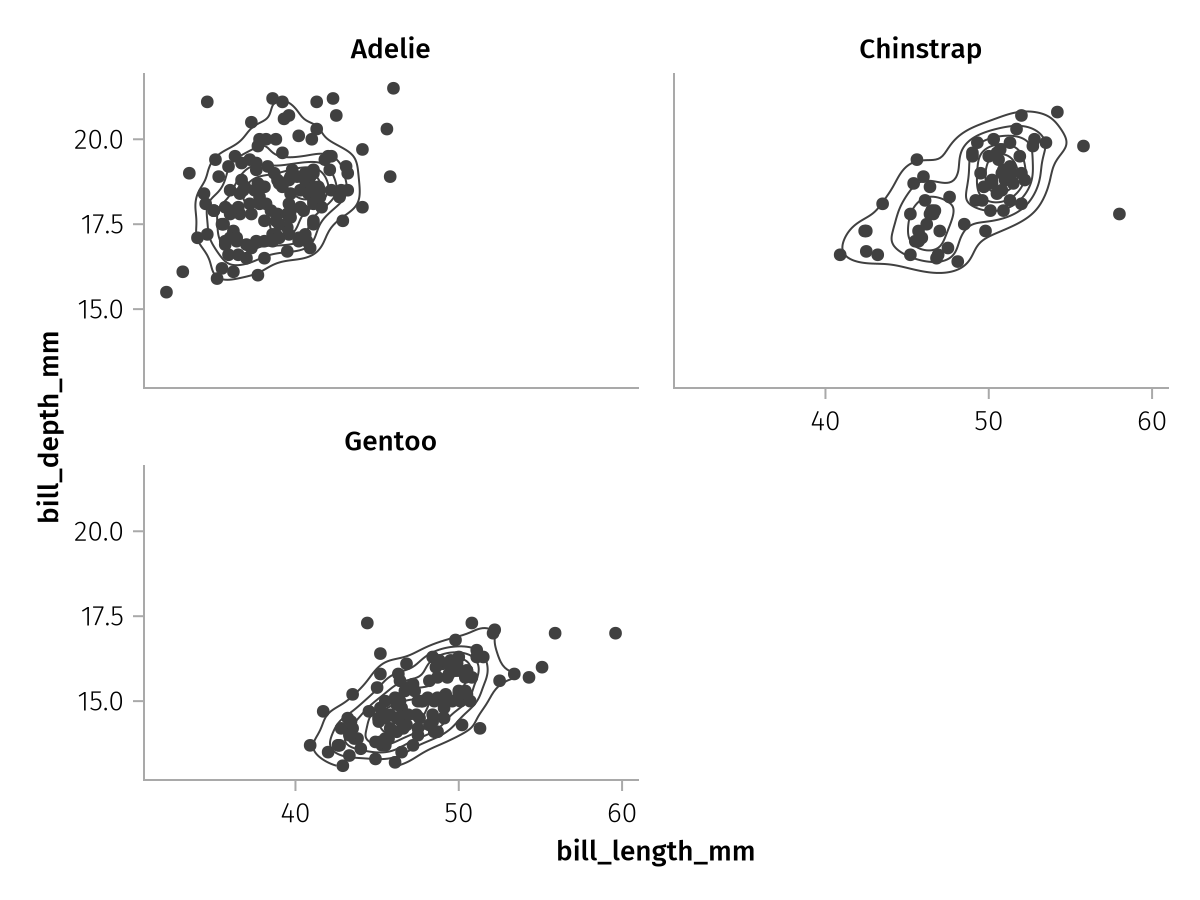
The wrapped layout always tries to approach an approximately square configuration of facets. Another option is the col mapping which distributes groups along the columns of a grid:
col_faceted = facet_base * mapping(col = :species)

draw(col_faceted)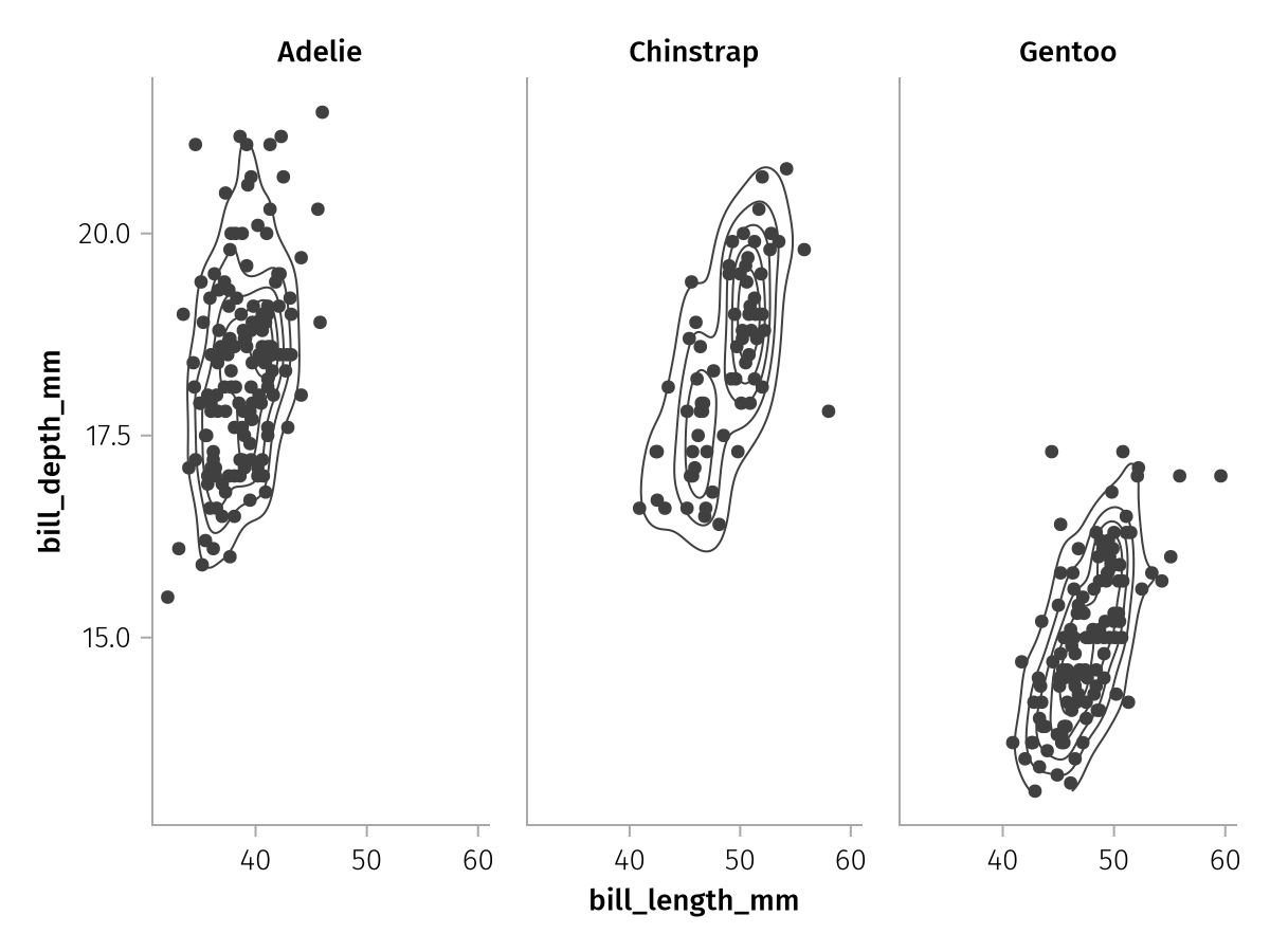
Or the row mapping which does the same along the rows:
row_faceted = facet_base * mapping(row = :species)

draw(row_faceted)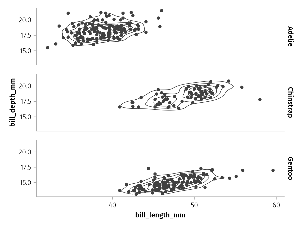
The row and col mapping are usually used at the same time, let's pull in the :sex variable for the rows:
row_col_faceted = facet_base * mapping(row = :sex, col = :species)

draw(row_col_faceted)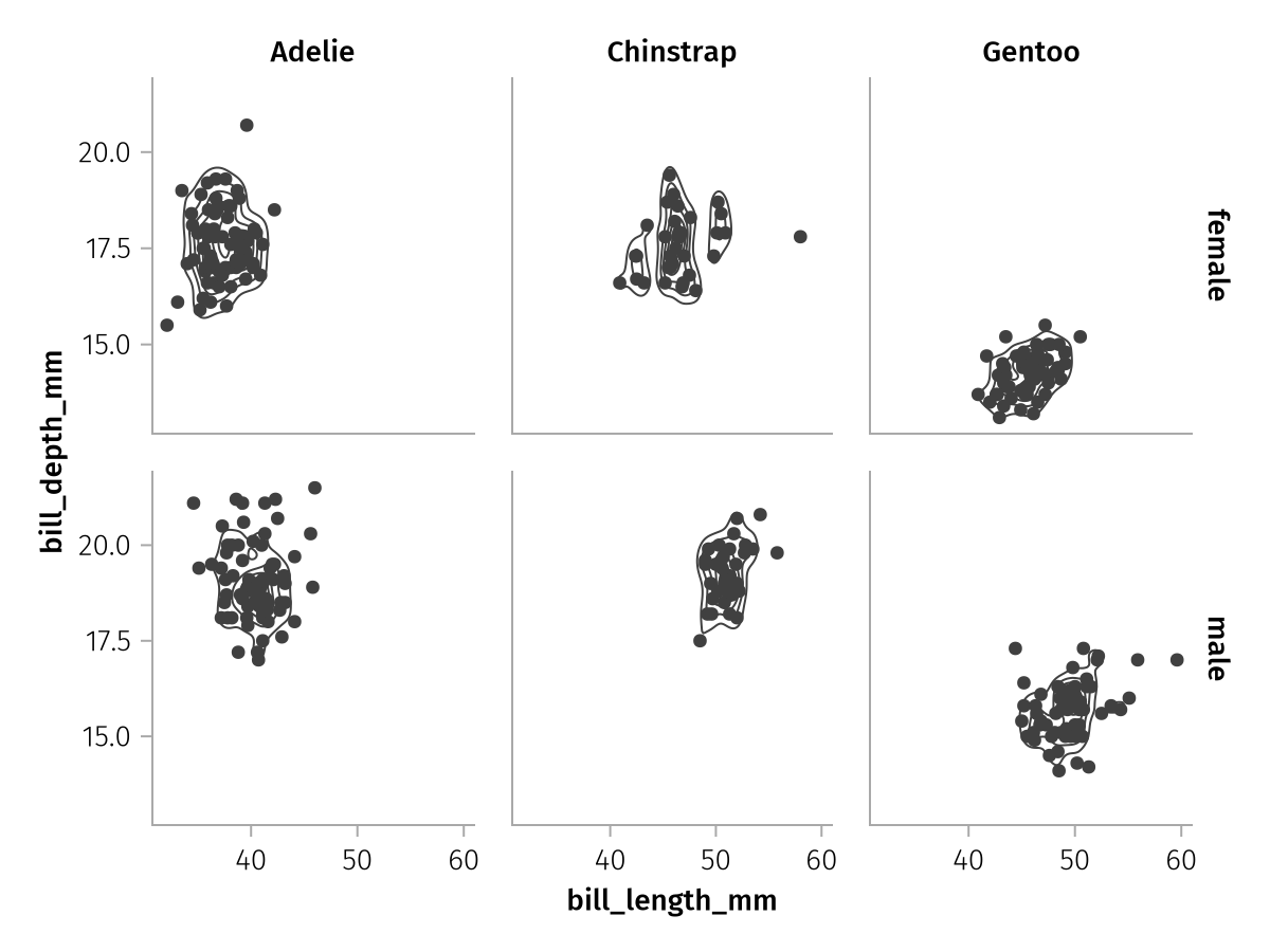
Axis linking
Depending on the size of the faceted axes and the distribution of data within each facet, it can make sense to change the default axis linking mode, in which all x axes and all y axes are linked, respectively.
The draw function accepts a facet keyword for this purpose, with the suboptions linkxaxes and linkyaxes. Let's take a look at the values that these keywords can take.
The default setting is equivalent to :all:
spec = data(penguins) *
    mapping(:bill_length_mm, :bill_depth_mm, row = :sex, col = :species) *
    visual(Scatter)

draw(spec; facet = (; linkxaxes = :all, linkyaxes = :all))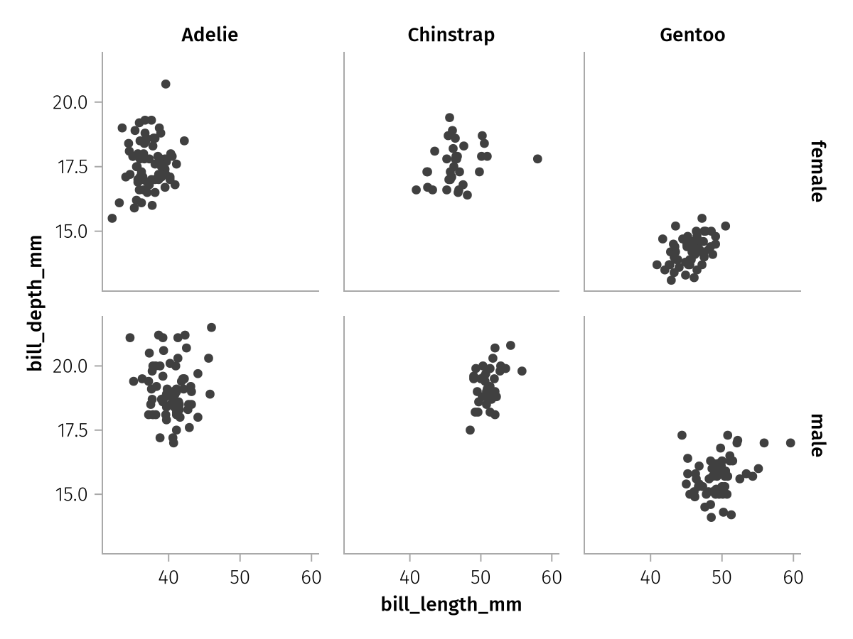
With the setting :minimal, linking will be reduced to each column and row. You can see how the empty space in each facet is significantly reduced but it is a little harder to compare between rows or columns.
draw(spec; facet = (; linkxaxes = :minimal, linkyaxes = :minimal))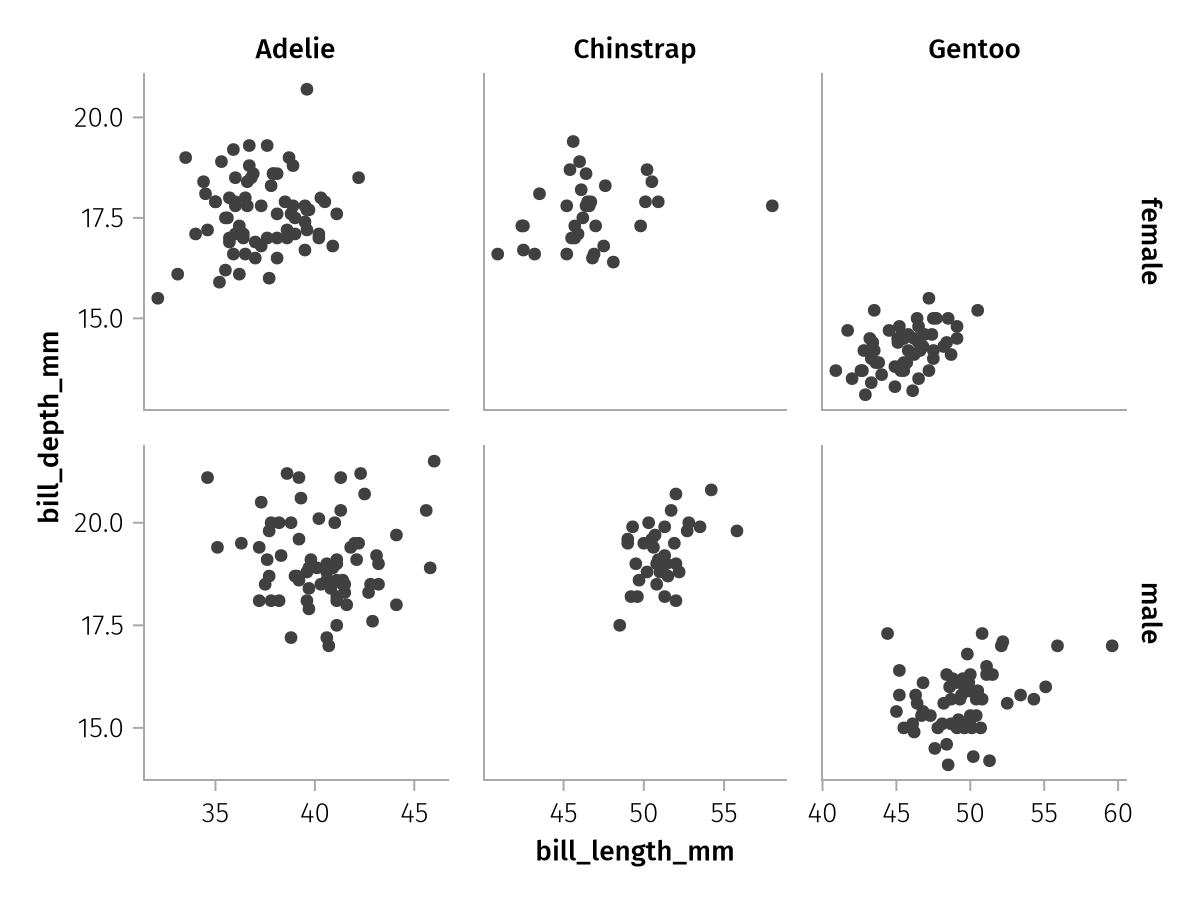
If no linking is desired at all, the setting :none or false can be selected. Be aware that unlinked facet plots can be quite hard to read, however.
draw(spec; facet = (; linkxaxes = :none, linkyaxes = :none))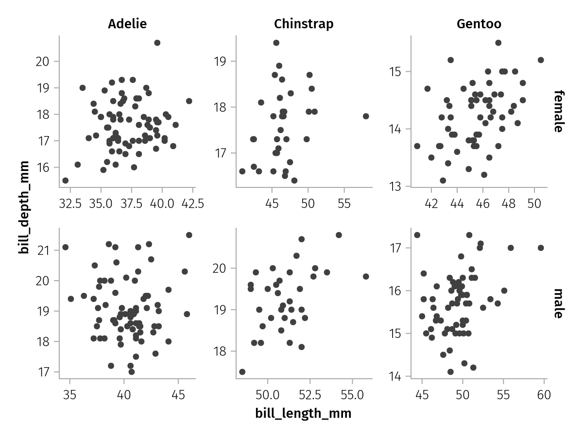
Combining faceted and unfaceted layers
Within a stack of layers, not every layer has to have the same facetting structure. It is possible to apply faceting only to some, but not all layers. (Note, however, that it is not possible to combine layout with row or col facetting.)
For example, right now we're plotting only a subset of the penguins into each facet. But we might want to have all penguins visible for a better visual reference. We can achieve this goal by adding an unfaceted layer together with our faceted one. The unfaceted layer will simply be repeated in every facet.
all_faded = data(penguins) *
    mapping(:bill_length_mm, :bill_depth_mm) *
    visual(Scatter, color = :gray90)
row_col_plus_all_faded = all_faded + row_col_faceted

draw(row_col_plus_all_faded)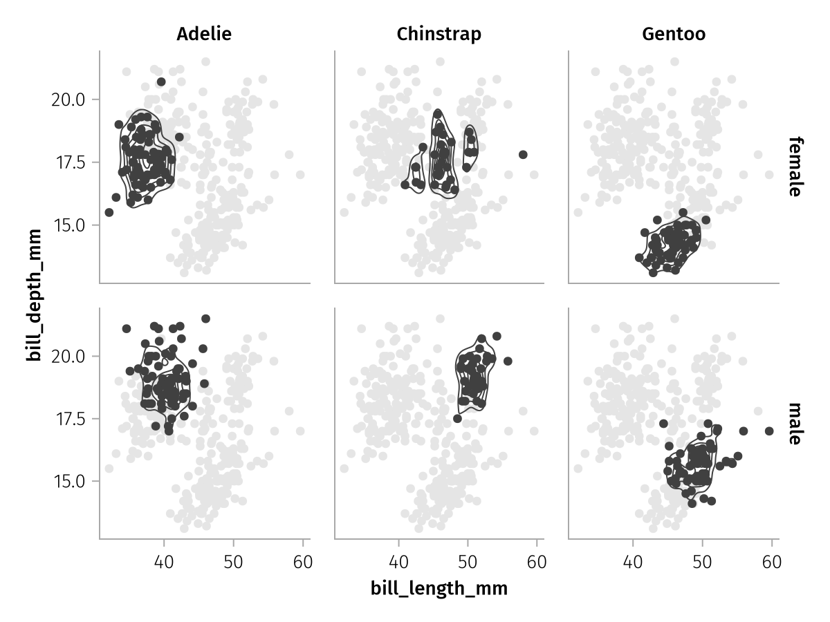
Grouping
What if we want to show one contour plot per group in a single facet, but we don't want to split by color or any other aesthetic? In that case, we can use the group mapping, which simply splits a layer into multiple separate plots without adding any other visual properties.
split_contours = data(penguins) *
    mapping(:bill_length_mm, :bill_depth_mm, group = :species) *
    AlgebraOfGraphics.density() * visual(Contour)

draw(split_contours)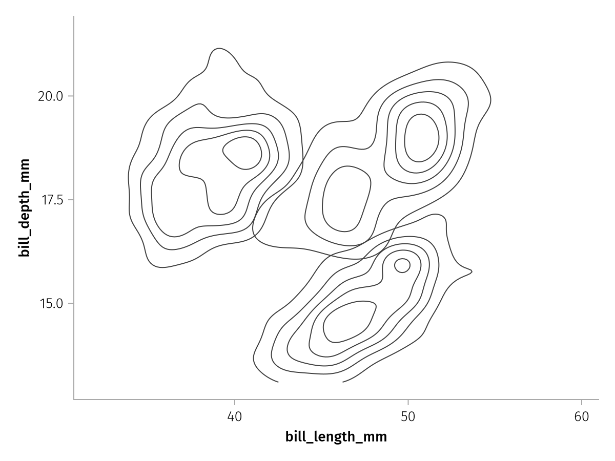
The group mapping is in practice mostly used to split lines apart. Consider this dataframe of time series of 20 subjects, where we don't care which subject is which:
n = 20
df = (;
    time = repeat(1:50, n),
    measurement = reduce(vcat, [cumsum(randn(50)) for _ in 1:n]),
    id = repeat(string.("Subject ", 1:n), inner = 50)
)

lines_ungrouped = data(df) * mapping(:time, :measurement) * visual(Lines)
draw(lines_ungrouped)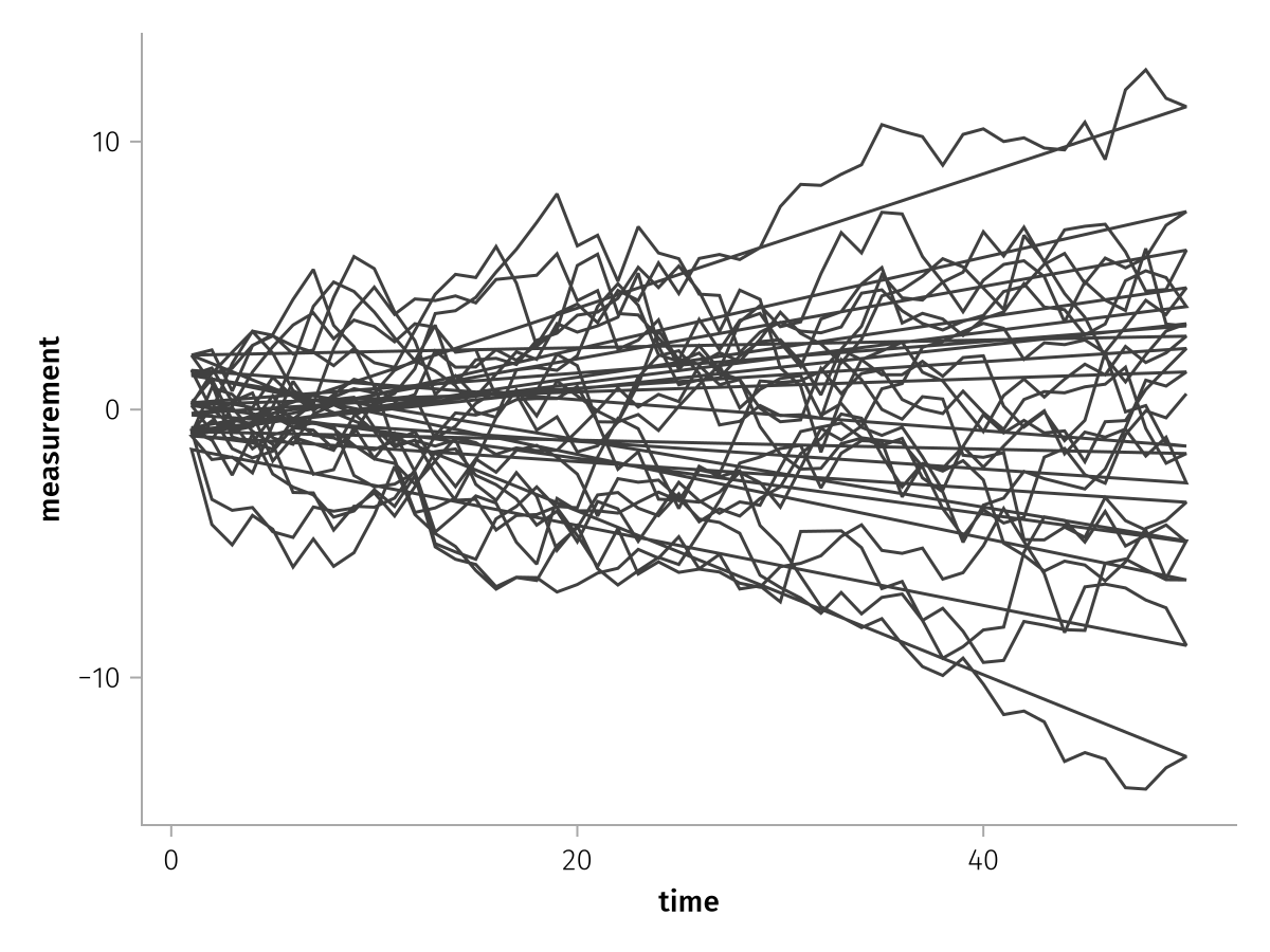
There's one continuous line that zigzags back and forth. When we add the group mapping, each line is drawn separately:
draw(lines_ungrouped * mapping(group = :id))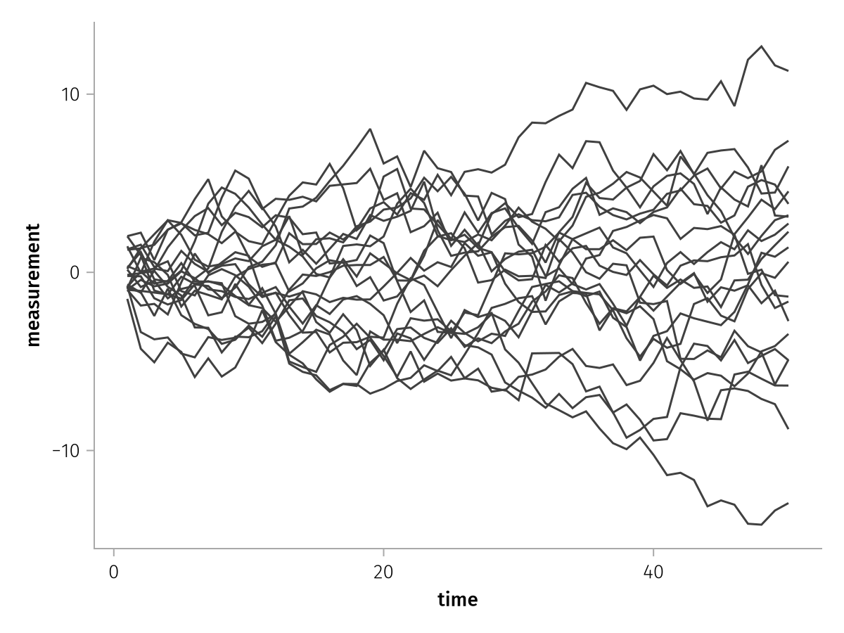
Summary
This concludes chapter II of the intro tutorial series. You have learned how to make use of the four built in mappings layout, row, col and group and how to combine facetted with unfacetted data for more flexible visualizations. Read on to find out how to change figure, axis, legend and colorbar attributes.